Dashboard
- Open the Dashboard tab for 4 stat cards: On Pace?, Delivery Forecast, Target Date, and Progress — each answering a key project question at a glance
- On Pace? compares completed work to work due by today and shows the verdict (Ahead of pace / On pace / Behind pace) plus the delta — color-coded green or red (this card has no amber state)
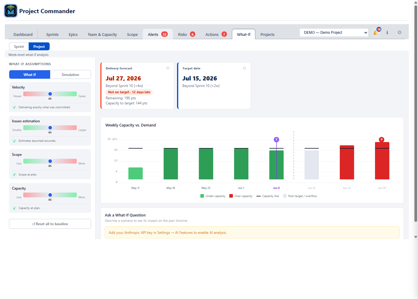
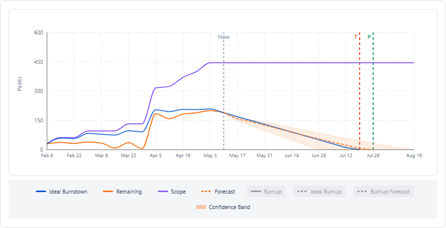
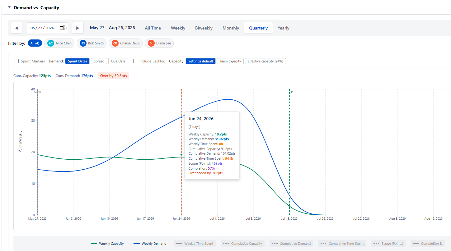
- Delivery Forecast shows the projected date, remaining work, and capacity to target — clipped at the target date, with capacity beyond it stated on its own line (N pts capacity available after target date) — plus the deliverability verdict (the matching sprint or Beyond Sprint N (+gap) appears on the Target Date card, not here). The card explains its inputs: amber notices when the Team/Effective model resolves to zero capacity, or when efficiency is an assumed 80% rather than a measurement
- Dashboard cards expose the relevant settings — pace measure, target date source (latest due / fixed), forecast (capacity) model, demand model, and scope growth
- Delivery Forecast — capacity model × demand model grid — every capacity model (Sprint capacity, Effective capacity, Team capacity, Velocity) against every demand model (Ignore / Respect dependencies, Resequence work, Critical Chain floor); each cell shows its finish date, gap to target, and on-target odds, shaded green / amber / red, with ★ Earliest / ▲ Latest flags and a detail panel for the selected pairing. Click a square to drive the Delivery Forecast card; the demand model is shared with the Scope and What-If tabs
- Baselines — capture named snapshots of the plan; a timeline (forecast and target, with a period picker to focus on any date range) and a table track slip against target over time, with a per-baseline breakdown on hover; frozen snapshots saved per project and per program, rename/delete inline
- Project Statistics table with one-line factors covering Scope, Team Capacity, Commitment vs Delivery, Estimate Accuracy, Team Balance, Dependency Conflicts, and Alerts — each row has tooltips and expand-for-detail
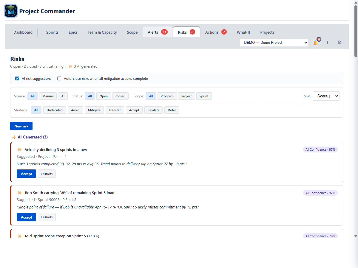
- Widgets below the cards: Top Open Risks (highest-severity unresolved risks) and Velocity History (recent sprint velocity bar chart)
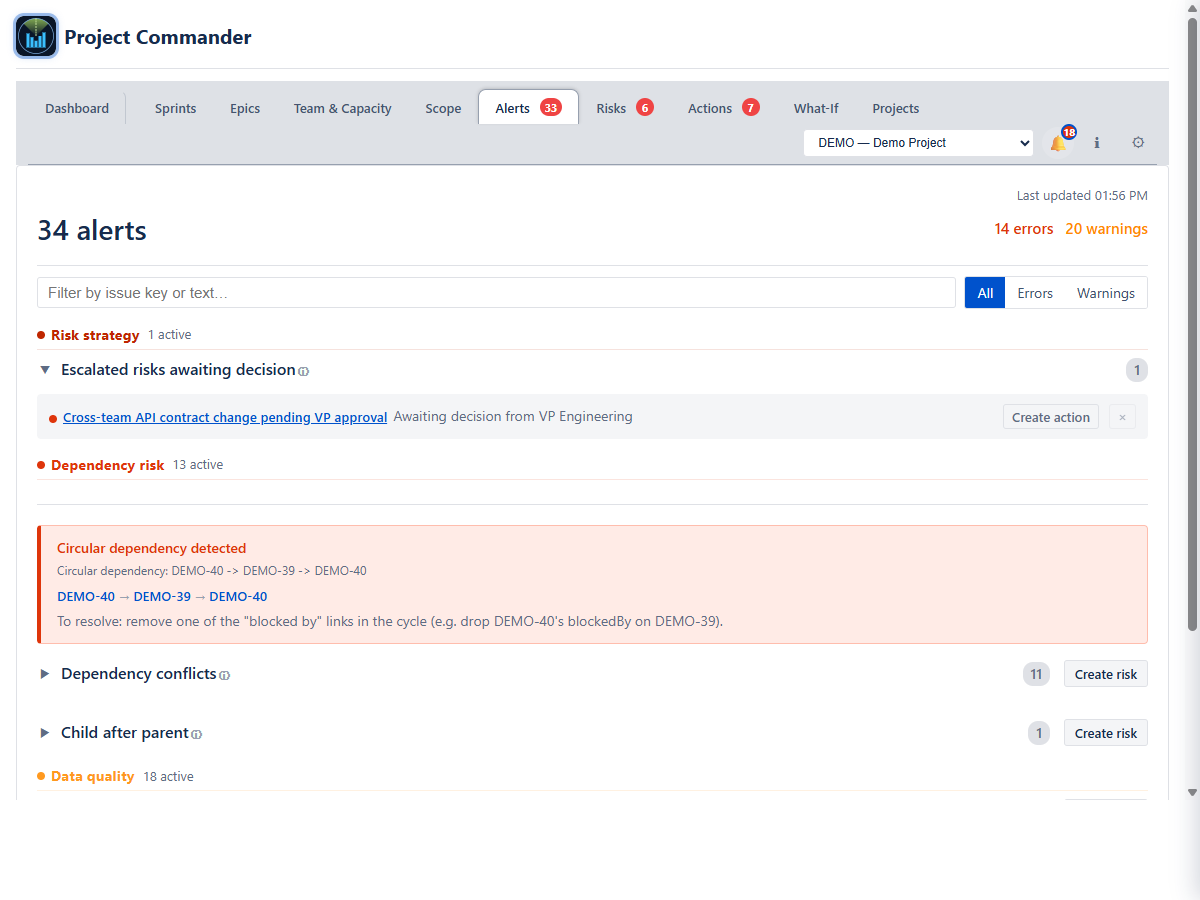
- Plan Quality Warnings banner for overloaded resources, dependency conflicts, and external dates at risk — each links to the relevant tab
- Inline AI Insights chat under the stat cards — ask natural-language questions and get answers as a grouped narrative (Project Status and Team & Plan Health) with a Recommendations list and a follow-up chat thread. Requires an API key
- Weekly Digest one-page summary and full PDF export