1. Installation
Project Commander is a Jira Cloud app that can be accessed as a full-page app or as a dashboard gadget.
Installing from Atlassian Marketplace
- Go to the Atlassian Marketplace
- Search for "Project Commander"
- Click Get it now
- Select your Jira Cloud site
- Confirm the installation
Accessing the Full-Page App
- In Jira, click Apps in the top navigation menu
- Select Project Commander from the dropdown
- The full-page app opens with all features available
Adding the Dashboard Gadget
- Navigate to a Jira dashboard
- Click Add gadget
- Search for "Project Commander"
- Click Add gadget
- The gadget will appear on your dashboard with the same features as the full-page app
2. Getting Started
When you first open Project Commander, click the Settings gear icon (⚙) in the tab bar to configure the app. Three settings determine what the app shows you.
Step 1: Set Your JQL Filter
The JQL filter defines which Jira issues appear across all tabs. Enter any valid JQL query, for example:
project = PROJ— all issues in a projectproject = PROJ AND sprint in openSprints()— only open sprint issuesproject = PROJ AND labels = "release-2.0"— issues with a specific label
All tabs share the same issue data from this filter.
Step 2: Enable Sprint Mode (Optional)
If your team uses Jira sprints, enable Sprint Mode and enter your Board ID. You can find the Board ID in your Jira board URL: /boards/123.
Sprint Mode unlocks the Sprints tab (sprint planning, drag-drop, auto-level) and the Sprint Review tab. All other tabs work with or without Sprint Mode.
Step 3: Choose an Estimation Mode
Choose how your team measures work:
- Points — uses Jira story points. Capacity defaults to a manual limit, or can be auto-calculated from team Points Per Sprint.
- Time — uses Jira time tracking (remaining estimate). Capacity is auto-calculated from team availability configured on the Demand vs. Capacity tab.
Step 4: Save
Click Save Configuration. The app will load your data and display the appropriate tabs.
Quick Start
At minimum you need a JQL filter. Sprint Mode and Board ID are only required if you want the Sprints tab. You can use the Demand vs. Capacity, Scope, Alerts, and Plan Review tabs with just a JQL filter.
Tab Overview
| Tab | Purpose | Requires |
|---|---|---|
| Dashboard | Single-screen project health overview with key metrics and navigation | Always visible |
| Sprints | Sprint planning with drag-drop, auto-level, and capacity tracking | Sprint Mode ON + Board ID |
| Sprint Review | What-if analysis and Monte Carlo simulation for sprints | Sprint Mode ON |
| Demand vs. Capacity | Team capacity, time off, holidays, and demand vs capacity chart | Always visible |
| Scope | Scope and burndown timeline chart with delivery forecast | Always visible |
| Alerts | Issue problems and dependency analysis | Always visible |
| Epics | Epic progress, forecasts, scope growth, and cross-epic dependencies | Always visible |
| Plan Review | Weekly timeline what-if and Monte Carlo based on due dates | Always visible |
3. Configuration
Click the Settings gear icon (⚙) in the tab bar to open the configuration panel. Settings are saved per Jira site and shared across all users.
Settings Reference
Settings appear in this order. Some are only visible when certain conditions are met.
| Setting | Type | Default | Visible When |
|---|---|---|---|
| JQL Filter | Text area | Empty | Always |
| Epics | Checkbox | On | Always |
| Sprint Mode | Checkbox | On | Always |
| Board ID | Number | Empty | Sprint Mode ON |
| Include Backlog | Checkbox | On | Sprint Mode ON + Board ID entered |
| Capacity Mode | Radio: Per Sprint / Per User | Per Sprint | Sprint Mode ON |
| Progress Indicator | Dropdown | Depends on Capacity Metric | Sprint Mode ON |
| Capacity Limit | Number (min: 1) | 40 (sprint) / 20 (user) | Sprint Mode ON |
| Sprint Length | Dropdown: 2/3/4 weeks | 2 weeks | Sprint Mode ON |
| Historical Lookback | Dropdown: 1–20 | 5 | Inline on Sprints and Scope tabs |
| Capacity Metric | Dropdown (or locked) | Story Points | Always (locked in Time Mode) |
| Estimation Mode | Radio: Points / Time | Points | Always |
| Time Unit | Dropdown: Hours / Days | Hours | Capacity Metric = Remaining Estimate |
| Display Columns | Multi-select with search | Key, Summary, Assignee, Story Points | Always |
| AI Features | Password field | Empty | Always |
Setting Details
JQL Filter
Standard Jira JQL syntax. This query fetches the issues used across all tabs (Demand vs. Capacity, Scope, Alerts, Plan Review).
Epics
Shows or hides the Epics tab. When enabled, you get high-level epic progress tracking, delivery forecasts, scope growth analysis, and cross-epic dependency views.
Sprint Mode
Enables sprint-based features. When on, seven sub-settings appear indented below. When off, the Sprints tab and Sprint Review tab are hidden, but all other tabs continue to work using the JQL filter.
Board ID
Your Jira board number, found in the board URL (/boards/123). Required for the Sprints tab to load sprint data.
Include Backlog
When enabled, unscheduled backlog issues from the board appear below the sprint list. This setting only appears once you have entered a Board ID.
Capacity Mode
- Per Sprint — one capacity limit shared across the entire sprint. Demand is the sum of all issue estimates.
- Per User — individual capacity limits per team member per sprint. Auto-Level distributes work to balance each person's load.
Progress Indicator
Controls the small progress display in each sprint card header.
- Points (Done / Total) — available when Capacity Metric is Story Points. Shows completed story points as a percentage of total.
- Estimate (Remaining / Original) — available when Capacity Metric is Remaining Estimate. Shows how much remaining estimate has been worked off relative to original estimate.
- Work Ratio — available when Capacity Metric is Remaining Estimate. Shows time spent as a percentage of total effort (spent + remaining).
Capacity Limit
The default capacity when no other source is active. The label changes based on your Capacity Mode:
- Per Sprint: "Capacity limit per sprint" — the default capacity for each sprint as a whole
- Per User: "Capacity limit per user" — the default capacity for each individual team member
This limit is used when Default is selected on a sprint's header. If you click Team, team-based calculations take over (Per User mode only). If you click Manual, you enter your own number. See How Capacity Works for the full explanation.
Sprint Length
Duration of new sprints created by Auto-Level: 2, 3, or 4 weeks. Auto-Level generates sequential, contiguous dates based on this setting.
Historical Lookback
Controls how many past periods are included in velocity calculations and scope/burndown charts. Appears as an inline dropdown on the Sprints tab (next to Use Velocity) and the Scope tab (visible when Burndown Forecast is on). The label adapts: "Last N sprints" when a Board ID is configured, or "Last N weeks" when using JQL only. Range: 1–20, default 5.
Capacity Metric
Determines which Jira field measures work across the app. You don't need to change this yourself — it's set automatically when you choose an Estimation Mode:
- Points Mode → automatically set to Story Points
- Time Mode → locked to Remaining Estimate
Estimation Mode
Controls how capacity is determined:
- Points — capacity defaults to the Capacity Limit setting, but can also be auto-calculated from team members' Points Per Sprint on the Demand vs. Capacity tab.
- Time — sprint capacity is auto-calculated from team members' weekly capacity values configured on the Demand vs. Capacity tab.
Switching Estimation Mode automatically adjusts Capacity Metric and Progress Indicator. See Estimation Modes for the full cascade.
Time Mode requires team setup
In Time Mode, a warning appears if no team members are configured. Go to the Demand vs. Capacity tab to add team members, set their hours, and configure holidays and time off.
Time Unit
Display time values in hours or days. Only visible when Capacity Metric is set to Remaining Estimate. Uses an 8-hour workday for conversion (1 day = 8 hours).
Display Columns
Choose which columns appear in sprint issue tables. The default set is Key, Summary, Assignee, and Story Points. There are 20 standard columns available:
Type, Key, Summary, Assignee, Reporter, Priority, Status, Story Points, Original Estimate, Remaining Estimate, Time Spent, Sprint, Start Date, Due Date, Epic, Epic Link, Parent, Subtasks, Linked Issues, Labels.
To add columns, click the dropdown and check the ones you want. To search for Jira custom fields, type at least 2 characters in the search box. You can also type a name and press Enter to add a custom column.
AI Features
Enter an Anthropic API key to enable AI-powered features: the Ask AI chat on the Dashboard, and AI risk analysis on the Sprint Review and Plan Review tabs. The key is stored in your app configuration and used to call Claude. Format: sk-ant-...
Auto-Switching Cascade
Switching Estimation Mode automatically adjusts related settings to stay consistent:
| When You Switch To | What Changes Automatically |
|---|---|
| Points | Capacity Metric → Story Points, Progress Indicator → Points |
| Time | Capacity Metric → Remaining Estimate (locked), Progress Indicator → Estimate |
This means you only need to choose your Estimation Mode — the other settings follow automatically.
4. Dashboard Tab
The Dashboard is your project's home screen — a single view that shows overall health, key metrics, and where to focus your attention. It is always visible as the first tab, regardless of Sprint Mode or Board ID settings. Click any card to navigate directly to the relevant detail tab.
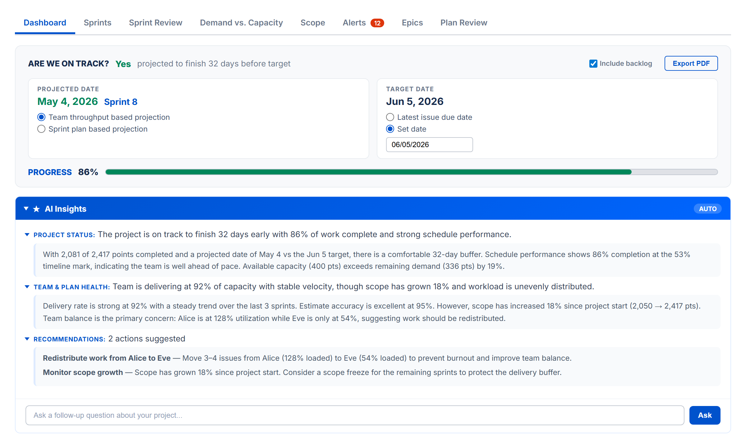
Are We On Track?
The top card answers one question: "Are we on track?" It compares the projected completion date against the target date and shows status as OK (green), Caution (amber), or At Risk (red).
Projected Date & Target Date
Two side-by-side panels let you configure the projection:
- Projected Date — choose between Team throughput based (calculated from historical delivery rate and future capacity) or Sprint plan based (end date of the last sprint with assigned work)
- Target Date — choose Latest issue due date (auto-derived) or Set date (manual date picker)
- Include backlog checkbox (Sprint Mode) — include or exclude backlog issues from calculations
Progress Bar
A progress bar shows overall completion percentage, color-coded to match the on-track status.
AI Insights
A collapsible panel that auto-generates an AI analysis of your project status. Each bullet point is prefixed with PROJECT STATUS: or TEAM & PLAN HEALTH: and is expandable for more detail. Recommendations are listed separately. You can ask follow-up questions in the chat input.
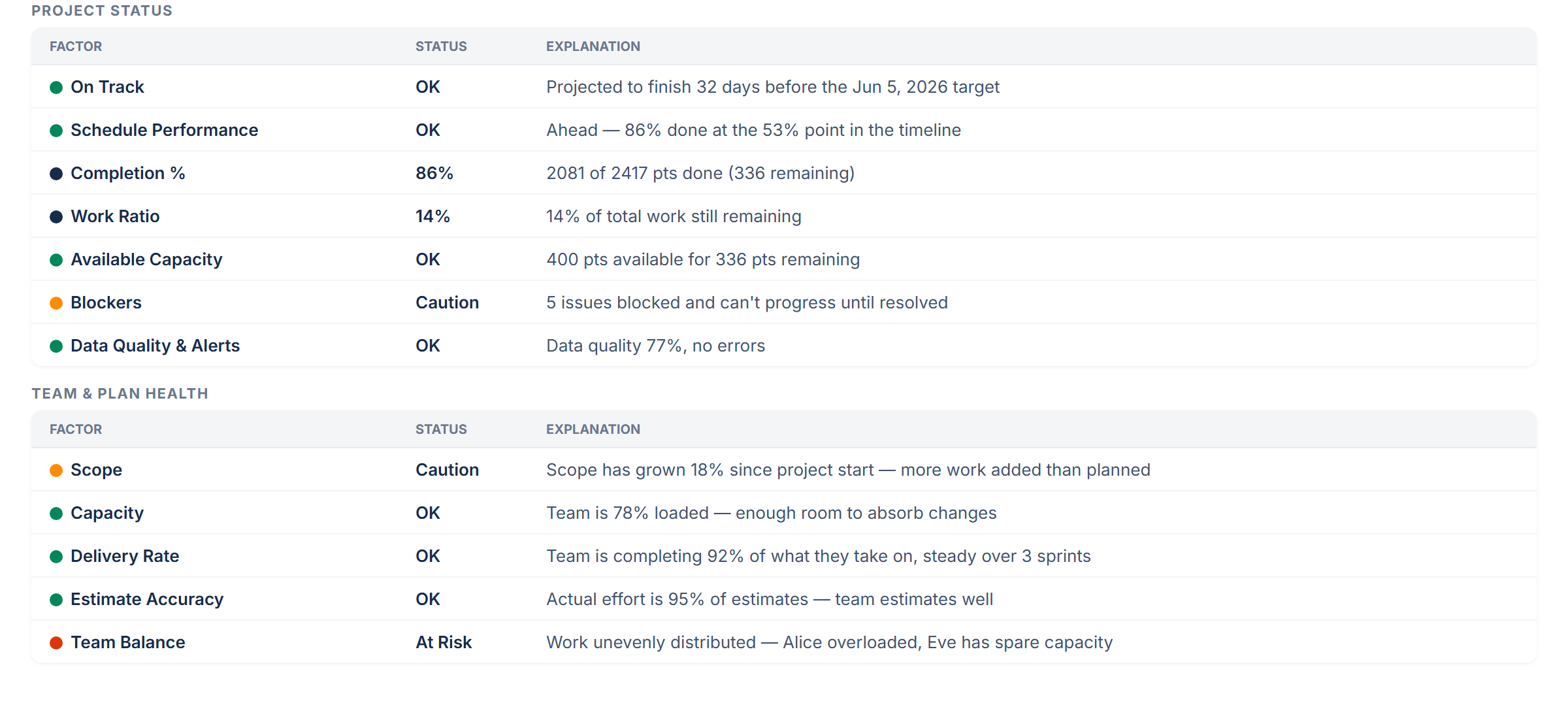
Project Status Table
An expandable factor table showing project health indicators:
| Factor | What It Shows |
|---|---|
| On Track | Projected vs target date comparison with days early or late |
| Schedule Performance | Completion percentage vs timeline elapsed — are you where you should be? |
| Completion % | Percentage of planned work done (1 - remaining / original estimate) |
| Work Ratio | Remaining work as percentage of total work |
| Available Capacity | Team capacity remaining through target date vs remaining demand |
| Blockers | Count of blocked issues with dependency details |
| Data Quality & Alerts | Data confidence score plus error and warning counts |
Team & Plan Health Table
A separate expandable factor table for execution health:
| Factor | What It Shows |
|---|---|
| Scope | Project-wide scope growth percentage since start |
| Capacity | Team utilization percentage (ideal range: 60–90%) |
| Delivery Rate | Percentage of capacity actually delivered, with trend |
| Estimate Accuracy | Time spent vs original estimate — are estimates reliable? |
| Team Balance | Workload distribution across team members |
Each row shows a status dot (green/amber/red/black) and a plain-language explanation. Click any row with a caret to expand for detailed breakdown.
Global Target Date
The target date is shared across the Dashboard, Sprint Review, and Plan Review tabs. Setting it in one place updates all three. The Sprint Review and Plan Review tabs automatically select the sprint or week that matches the target date.
Export PDF
Click Export PDF in the top-right corner to download a snapshot of the dashboard as a PDF file.
Weekly Digest
A comprehensive weekly summary of your project sent to stakeholders. It includes:
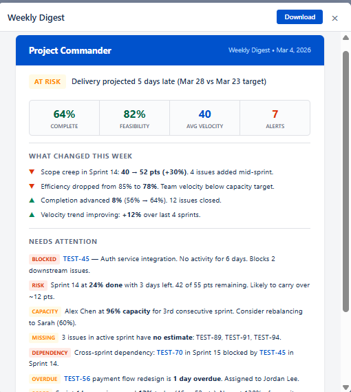
- Status badge — ON TRACK (green), AT RISK (amber), or CRITICAL (red) based on health score and delivery forecast
- Status reason — one-line explanation, e.g. "Delivery projected 5 days late (Mar 28 vs Mar 23 target)"
- Key numbers — Completion %, Average Velocity, and Alert count
- What Changed This Week — scope creep, efficiency changes, completion progress, and velocity trends with up/down indicators
- Needs Attention — all active alerts with severity-colored badges (BLOCKED, RISK, SCOPE, CAPACITY, MISSING, DEPENDENCY, OVERDUE) and descriptions
- Outlook — forward-looking summary with velocity projection, remaining backlog, estimated sprints and clearance date
Daily Alert
A concise notification sent when new issues are detected that need immediate attention:
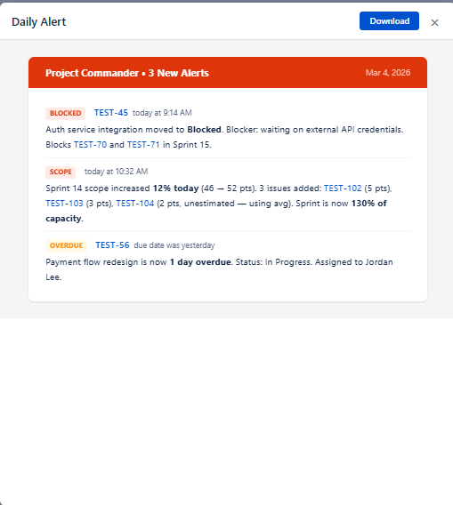
- Red header with alert count (e.g. "3 New Alerts")
- Alert items — each shows a severity badge, issue key (linked), timestamp, and description
- Alert types — BLOCKED (stale blockers), SCOPE (mid-sprint scope increase), OVERDUE (past due date), and others
Ask AI
After the health cards, an Ask AI section lets you type natural-language questions about your project. For example: "Which sprints are at risk?", "Who is overloaded?", or "What should I focus on this week?"
The AI receives your project context — sprints, issues, capacity, velocity, and feasibility data — and returns a focused answer. This feature requires an Anthropic API key configured in Settings (see AI Features).
No Data State
If no JQL filter is configured, the Dashboard shows a "No Data Available" message prompting you to open Settings and configure a JQL filter.
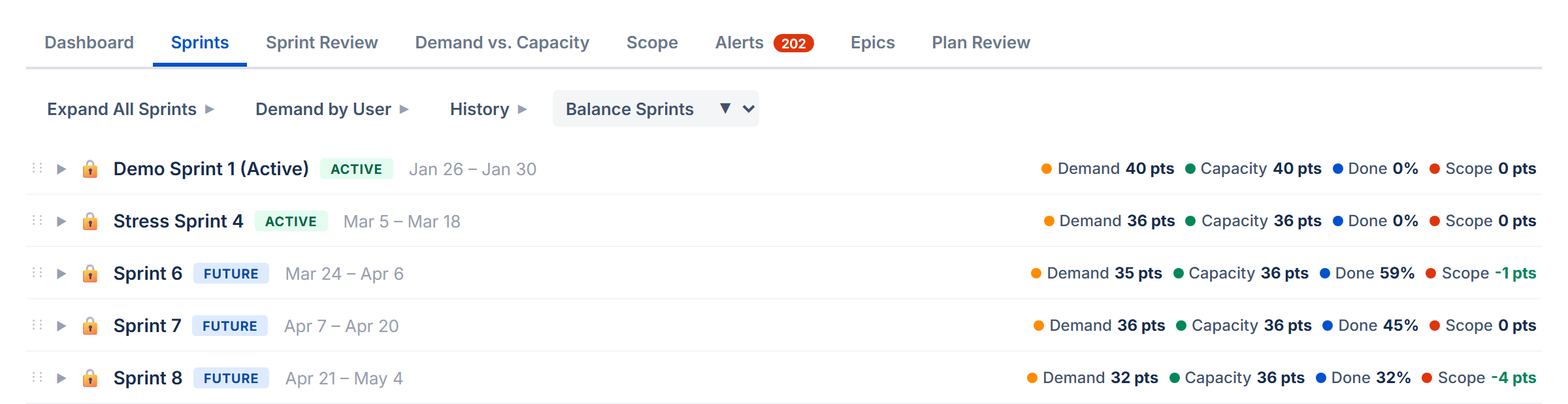
5. Sprint View
The Sprints tab is where you plan and manage your work across sprints. Each sprint appears as a collapsible card showing its issues, capacity, and team workload. To see the Sprints tab, enable Sprint Mode and enter a Board ID in Settings.
What You See
The page is organized top to bottom:
- Action bar — Dependencies button, refresh, and other actions
- Toolbar — a unified row with collapsible sections (click each label arrow to expand):
- Velocity — historical sprint performance chart and KPI tiles (see Velocity Tracking)
- Demand by User — colored chips per assignee showing workload across all sprints. Click a chip to filter sprints to that person.
- Auto-Level — strategy pills for auto-leveling (see Auto-Level)
- Collapse/Expand All — toggle all sprint cards and backlog open or closed
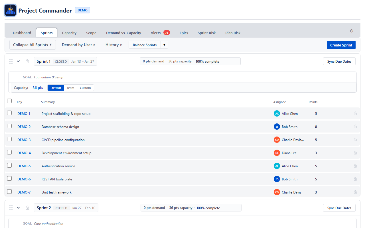
- Create Sprint — a dedicated row for creating new sprints
- Sprint cards — one card per sprint, in board order. Each card has a compact header row and an expandable details panel. Below the header is the issue table.
- Backlog — if Include Backlog is on, a backlog section appears at the bottom with unscheduled issues.
Sprint Card Header
The header row gives you a quick summary without expanding anything:
- Grab handle — drag to reorder sprints on the page
- Chevron — expand or collapse the issue table
- Lock icon — lock the sprint so Auto-Level won't touch it
- Sprint name and dates
- Header stats — compact inline display of issue count, demand, and capacity remaining. When done issues exist, demand shows "X remaining / Y total" so you can see both remaining and total work at a glance. Capacity shows how much capacity is left after subtracting completed work. If remaining demand exceeds capacity remaining, the demand turns red and an "over by X" warning appears.
- Progress bar — a small indicator showing how much work is done. In Points Mode this shows completed points out of total. In Time Mode this shows how much of the original estimate has been worked off.
- Action buttons — Sync Dates, Start, Complete, Delete, Refresh (which buttons appear depends on the sprint state)
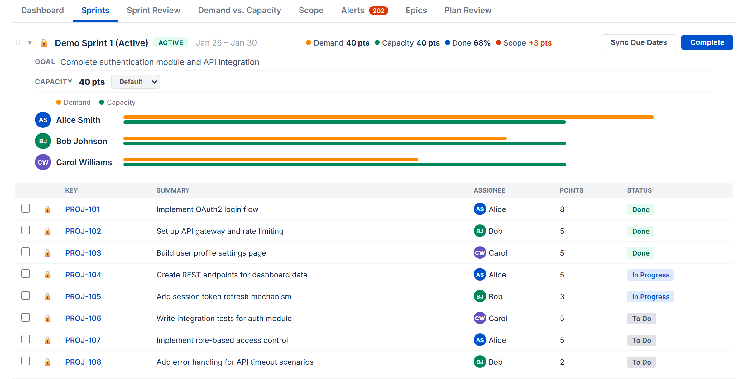
Sprint Details Panel
Click the Sprint Details toggle below the header to expand additional information:
- Goal — the sprint goal. Click the text to edit it; changes save to Jira automatically.
- Scope Creep (active sprints only) — compares the sprint's current scope to what it had when it started. Shows something like "Scope: 40 pts → 52 pts +30%". Click it to see exactly which issues were added or removed mid-sprint.
- Capacity settings — the capacity value (click to edit), unit label, and Default / Team / Manual toggle for controlling the capacity source (see How Capacity Works below).
- By User — a collapsible user filter with two modes:
- Collapsed — colored avatar circles for each person. Click any avatar to toggle that user's visibility — excluded users turn gray and their issues are hidden from the sprint. A red ring means over capacity, green means within limits.
- Expanded (click the chevron) — full user rows with avatar, name, demand vs capacity bar, and stats. Click any row to toggle that user's filter. Excluded rows are dimmed. The filter state is shared between both views.
Issue Table
When a sprint is expanded, you see its issues in a table. The columns shown are the ones you selected in Display Columns (Settings). Every row has:
- A checkbox for selecting the issue (used for multi-select drag)
- A lock icon to pin the issue in place (it won't be moved by Auto-Level or dragged accidentally)
- The issue key (e.g., PROJ-42) — if this issue has a dependency conflict, a warning icon appears next to the key
- Your configured columns (Summary, Assignee, Points, Status, etc.)
Due dates in the past are highlighted in red. Assignees show a colored avatar chip.
Column Sorting
Click any column header to sort the issues in that sprint. Click again to reverse the order, and a third time to clear the sort. A small arrow (↑/↓) shows which column is sorted and in which direction.
Sorting is per-sprint (each sprint sorts independently) and resets when you reload. It is not saved. If you manually reorder an issue (by dragging within the sprint), the sort is cleared.
How Capacity Works
Each sprint has a capacity value that represents how much work it can hold. A Default / Team / Manual toggle in the sprint header controls where this number comes from:
| State | How It Looks | What Happens |
|---|---|---|
| Default | Default button highlighted | Uses the capacity limit from Settings |
| Team | Team button highlighted | In Per User mode: calculates each person's capacity from team config on the Demand vs. Capacity tab & sprint dates. In Per Sprint mode: same as Default. |
| Manual | Manual button highlighted | Opens an inline editor where you type a capacity value |
Default
The sprint uses the Capacity Limit from Settings. In Per Sprint mode, this is the whole sprint's capacity. In Per User mode, each assignee gets the per-user limit, and the sprint total is the sum (displayed as "N × limit = total").
Team
In Per User mode, capacity is calculated from team members configured on the Demand vs. Capacity tab. The app sums each member's weekly capacity values for the weeks that overlap the sprint, using overlap fractions for weeks that start or end mid-sprint. The display shows a formula: assignees × per-user capacity = sprint total.
In Per Sprint mode, Team behaves the same as Default — it uses the capacity limit from Settings.
The Team button is greyed out if no team members are configured on the Demand vs. Capacity tab.
Manual
Click Manual to open an inline number editor where you type a capacity value. In Per Sprint mode, this is the sprint total. In Per User mode, this is the per-user limit and the sprint total becomes the number of assignees times that limit.
Capacity Display
The sprint header shows capacity remaining — the total capacity minus completed work. This lets you compare remaining demand against remaining capacity at a glance. If remaining demand exceeds capacity remaining, the demand stat turns red and an "over by X" indicator appears. When no issues are done yet, capacity remaining equals the full sprint capacity.
In the Sprint Details panel, the label shows Capacity/Sprint: (in Per Sprint mode) or Capacity: (in Per User mode), followed by the capacity value. In Per User mode, the value is shown as a formula: "N × per-user = total". Click the value to switch to Manual mode and edit it.
6. Sprint Management
You manage the sprint lifecycle directly from each sprint card's action buttons.
Creating a Sprint
Click + Create Sprint below the sprint list. The new sprint gets dates that follow on from the last sprint, using the Sprint Length you configured (2, 3, or 4 weeks).
Starting a Sprint
Click Start on a future sprint to make it active. If you already have an active sprint, a warning asks you to confirm that you want two sprints running at the same time.
Completing a Sprint
Click Complete on an active sprint. If there are unfinished issues, a dialog lets you choose where to move them — to another sprint or back to the backlog. When the sprint completes, its velocity data is automatically captured for the Velocity section.
Deleting a Sprint
Click the delete button and confirm. The sprint is removed and its issues move to the backlog.
Editing the Goal
Open the Sprint Details panel, then click the goal text. Type your changes and press Enter or click away to save.
Syncing Issue Dates
You can align issue dates with sprint boundaries:
- Sync Dates (per sprint) — sets every issue's start date and due date to match that sprint's start and end dates
- Sync All — does the same for every sprint at once
- Remove All — clears start and due dates from all issues in all sprints
This is useful for features like the Demand vs. Capacity chart and Plan Review that rely on issue dates.
7. Drag and Drop
Moving Issues Between Sprints
Drag any issue row from one sprint and drop it onto another sprint card. The issue is moved in Jira immediately. You can also drag issues to the backlog at the bottom.
Moving Multiple Issues
Check the boxes next to several issues, then drag any one of them. All selected issues move together. A badge shows how many you're moving (e.g., "5 issues"). A bar above the sprint list shows your selection count with a Clear selection button.
Reordering Within a Sprint
Drag an issue up or down within the same sprint to change its position. A blue line shows where it will land. This custom order is saved and persists across sessions.
Reordering is disabled while a column sort is active. If you reorder an issue, the sort clears.
Auto-Scroll
While dragging, move your cursor near the top or bottom edge of the screen. The page scrolls automatically so you can reach sprints that aren't currently visible.
Locked Issues
Click the lock icon on an issue to prevent it from being dragged. Locked issues also stay in place during Auto-Level.
8. Auto-Level
Auto-Level is a planning tool that redistributes issues across sprints so that no sprint exceeds its capacity. It uses each sprint's capacity setting: Manual numbers if set, Team-calculated values if selected (Per User mode), or the Settings default otherwise. It respects dependencies (blockers always go in earlier sprints) and leaves locked issues and sprints alone. Everything happens as a preview first — nothing is saved to Jira until you explicitly accept.
How to Use It
- Expand the Auto-Level row in the Sprints toolbar (click the label arrow). A row of strategy pills appears: Priority, Size, Due Date, Balanced, Velocity, and Compare All. A Historical Lookback dropdown appears next to the pills.
- Click a strategy pill to start a session. The sprints rearrange in preview mode immediately. Each moved issue shows a purple badge indicating where it came from.
- Review the results. You can:
- Click a different strategy pill to try another approach
- Manually drag issues to fine-tune (these show orange badges)
- Click Undo to reset and try again
- When you're happy, click Accept to save all changes to Jira. Or click Exit to discard everything and leave the auto-level session.
Strategies
| Strategy | How It Decides What Goes Where |
|---|---|
| Priority | Puts the highest-priority issues first, filling sprints front to back |
| Size | Puts the smallest issues first, filling sprints front to back |
| Due Date | Puts the soonest-due issues first, filling sprints front to back |
| Balanced | Tries to spread work evenly. Places large issues first, picking the sprint where each one fits best based on remaining room, how much work each person already has in that sprint, and whether the sprint end date aligns with the issue's due date. |
| Velocity | A toggle pill that uses historical efficiency to set sprint limits. When active, the other four strategy pills are disabled. See Using Velocity as Capacity below. |
All strategies respect dependencies: if issue A blocks issue B, then A is always placed in an earlier (or same) sprint as B. If circular dependencies exist, they are detected and flagged so you know to resolve them.
Earliest Available Sprint
Priority, Size, and Due Date strategies pack issues into the earliest sprint with available capacity. This means an issue can move backward to an earlier sprint if there is room, not just forward. This ensures sprints are filled front-to-back as efficiently as possible.
What Gets Moved
- All non-done issues from unlocked sprints are picked up and redistributed
- Done, closed, and resolved issues stay where they are — and their completed work is subtracted from sprint capacity so remaining room is calculated accurately
- Subtasks are excluded from moves (they follow their parent issue)
- Locked issues stay in place
- Issues in locked sprints are not touched
- If an issue is larger than any sprint's capacity (oversized), it is placed in a dedicated overflow sprint to keep other sprints balanced
New Sprints
If the existing sprints don't have enough room, Auto-Level creates new ones (up to 10). New sprints get dates that follow on from the last sprint using your Sprint Length setting, and their capacity defaults to the average of your existing sprints.
Per-User Mode
When Capacity Mode is set to Per User in Settings, Auto-Level tracks each person's workload per sprint individually. If someone is overloaded in a sprint, their excess issues are moved to a sprint where they have room.
Using Velocity as Capacity
If you have velocity data (from completed sprints), the Velocity toggle pill appears in the strategy row. Click it to activate velocity-based capacity. This tells Auto-Level to calculate sprint limits based on each team member's historical efficiency against their real available capacity (from the Demand vs. Capacity tab), rather than using the configured limit or raw team availability.
When enabled:
- Per-user efficiency — for each team member, the app calculates how much of their available capacity they actually completed on average across recent sprints (capped at 100%). New members with no history use the team average.
- Adjusted sprint limits — each future sprint's limit is the sum of (member's future capacity × member's efficiency) for all active members. This gives a realistic prediction of actual output.
- Strategy pills disabled — the Priority, Size, Due Date, and Balanced pills are disabled because velocity-based distribution uses the efficiency-adjusted capacity directly.
For best results, configure your team on the Demand vs. Capacity tab first. If no team capacity data is available, the feature falls back to the original behavior (flat historical average velocity).
Compare All
Click Compare All to run all four strategies at once and see a side-by-side comparison. The Delivery Forecast panel appears showing:
- KPI cards for each strategy — which sprint delivery lands in, the estimated date, and how many sprints are overloaded. The best strategy is highlighted.
- Probability curves — Monte Carlo simulations for each strategy overlaid on one chart. You can see which strategy gives the highest probability of on-target delivery. Click legend items to show or hide individual curves.
Strategy colors: Priority (blue), Size (orange), Due Date (green), Balanced (purple), Original baseline (gray).
9. Velocity Tracking
Below the sprint cards, the Velocity section shows how your team has performed in past sprints. This data feeds into capacity calculations and the "Use velocity as capacity" option in Auto-Level.
KPI Tiles
Five summary tiles across the top:
- Avg Velocity — how much work the team typically completes per sprint
- Expected — projected output for the next sprint based on recent trends
- Per Week — average work completed per week
- Efficiency — what percentage of planned work the team actually completes (completed ÷ planned). When Capacity tab data is available, a separate efficiency-vs-capacity metric tracks completed work against real available hours.
- Completion — what percentage of planned work gets finished each sprint
Filtering by User
A row of user chips lets you see velocity for specific team members. Click a name to filter; click "All" to show the whole team. You can select multiple people.
Sprint History
A table showing each completed sprint: name, length, capacity, completed work, per-week rate, and efficiency. The best-performing and worst-performing sprints are highlighted.
Click any row to expand it and see individual issues from that sprint — which were completed, which were left incomplete, and which were added or removed mid-sprint.
Building Your Velocity Data
Velocity data accumulates automatically each time you complete a sprint. If you're starting fresh or want to backfill history, use these buttons:
- Import from Completed Sprints — scans all previously completed sprints on your board and imports their data
- Reload — refreshes the velocity data
- Clear — removes all stored velocity data (asks for confirmation first)
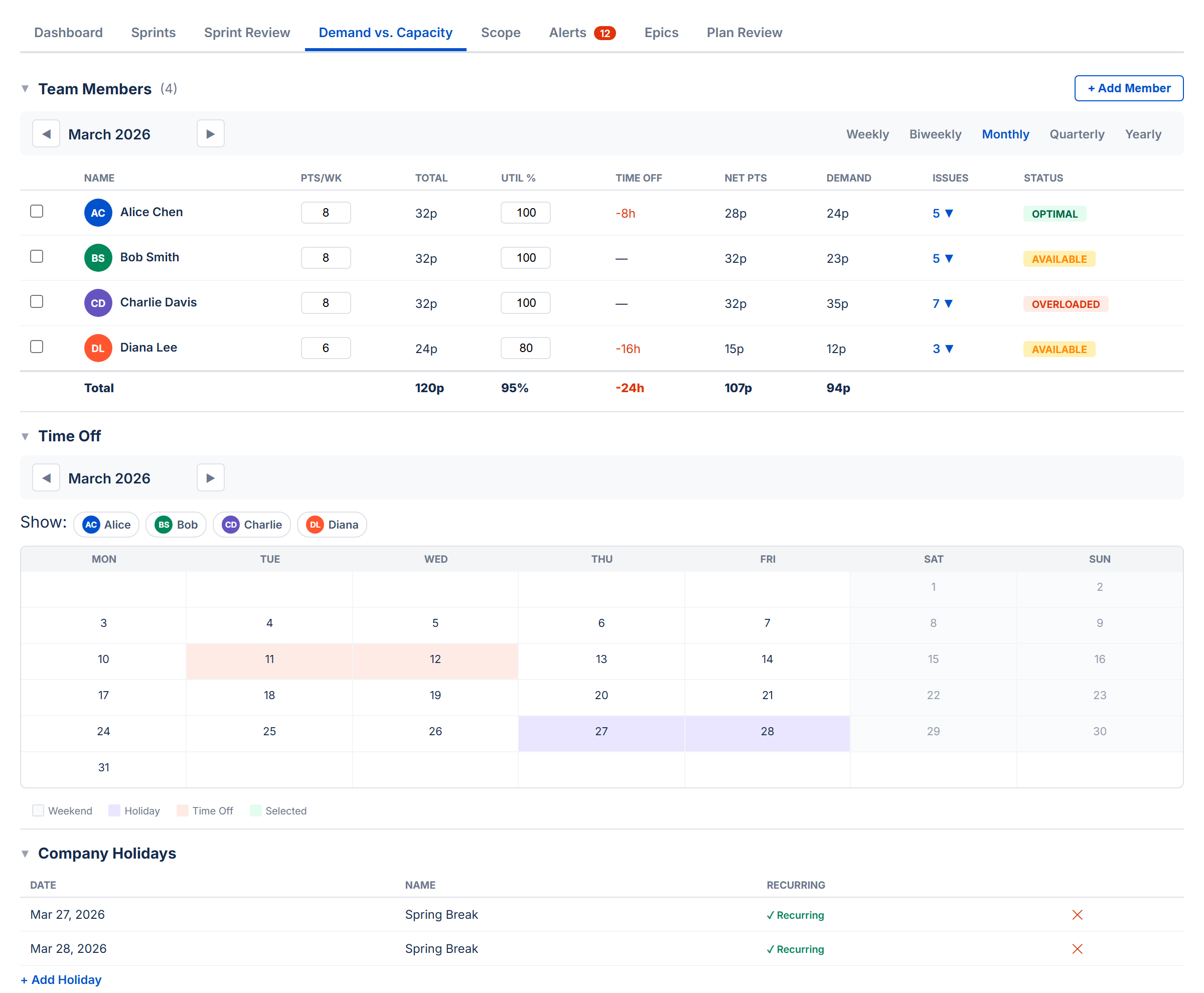
10. Demand vs. Capacity Tab
The Demand vs. Capacity tab combines team management and feasibility analysis in one place. It has four collapsible sections (all collapsed by default):
- Team Members — who's on the project, hours/week, utilization
- Time Off — individual time off entries
- Company Holidays — shared holidays
- Demand vs. Capacity Chart — envelope chart comparing demand against capacity over time
Three Sections
The tab has three collapsible sections. Click any section header to expand or collapse it:
- Team Members — your team roster and workload status
- Time Off — PTO calendar for individual team members
- Company Holidays — company-wide days off
Period Selector
A period bar at the top lets you choose the time range you're looking at: Weekly, Biweekly, Monthly, Quarterly, or Yearly. Arrow buttons navigate forward and back. All the numbers in the Team Members table (net capacity, demand, issue count) adjust to show values for the selected period.
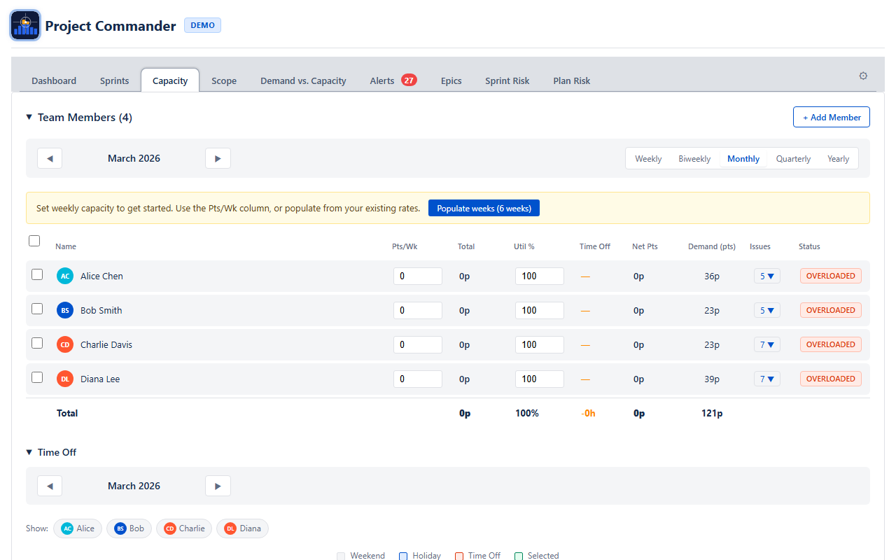
Team Members
A table showing each team member with these columns:
| Column | What It Shows |
|---|---|
| Name | Team member name with a colored avatar |
| Hrs/Wk or Pts/Wk | Capacity per week (editable). In Time Mode shows hours per week; in Points Mode shows points per week. Edit to set all weeks in the current period to that value. |
| Total | Total capacity for the selected period — the sum of all weekly values |
| Util % | Utilization percentage (editable). Adjusts how much of a member's capacity is available for project work. Defaults to 100%. Persists to team member configuration. |
| Time Off | Total hours deducted for holidays and PTO in the period. Click the toggle to expand a detail row showing each holiday and PTO entry with dates and hours. |
| Net Hrs / Net Pts | Net capacity after deductions. Calculated as Total capacity minus holiday deductions minus PTO hours. In Time Mode shows Net Hrs (or Net Days); in Points Mode shows Net Pts. This is the number used for workload status. |
| Demand | How much work is assigned to them in the period |
| Issues | Number of issues assigned, with expandable dropdown showing issue keys and summaries |
| Status | A color-coded badge comparing demand against net capacity (after deductions) |
You can select multiple team members using the checkboxes. The Cap/Wk column shows "varies" if weeks in the period have different values.
Weekly Capacity Model
Capacity is stored as explicit per-week values. Each team member has a capacity value for each ISO week (Monday–Sunday). Weeks with no value set default to zero.
- Weekly view: Shows and edits the value for that specific week.
- Monthly/Quarterly/Yearly view: Shows the per-week value if all weeks are the same, or "varies" if they differ. Editing sets all weeks in the period to the entered value.
This model gives you full control — reduce capacity for holiday weeks, ramp new members up gradually, or set different values for different sprints. All downstream calculations (sprint capacity, feasibility, risk) resolve to weekly granularity.
If you have existing team data from before the weekly model, a migration banner appears with a "Populate weeks" button that fills the selected period from your previous rates.
Status Badges
Each team member gets a color-coded status based on how their assigned work (demand) compares to their net capacity — capacity after holiday and PTO deductions:
| Status | When It Appears | Color |
|---|---|---|
| OVERLOADED | Demand is more than 115% of capacity | Red |
| OPTIMAL | Demand is 90–115% of capacity | Green |
| AVAILABLE | Demand is 60–90% of capacity | Yellow |
| UNDERLOADED | Demand is less than 60% of capacity | Gray |
Time Off
A calendar view for managing PTO. Click a date to mark a single day off. Use Ctrl+click to toggle individual days on and off. Use Shift+click to select a range of dates.
Time off and company holidays are automatically deducted from each member's capacity. The deductions appear in the Time Off column of the Team Members table. Click the toggle arrow to expand a detail row listing each holiday and PTO entry with its date and hours deducted. The resulting Net column shows capacity after all deductions.
Company Holidays
Add company-wide holidays by entering a date and name. Check the Recurring box to have the holiday repeat every year automatically. Holidays reduce available capacity for all team members.
11. Scope Tab
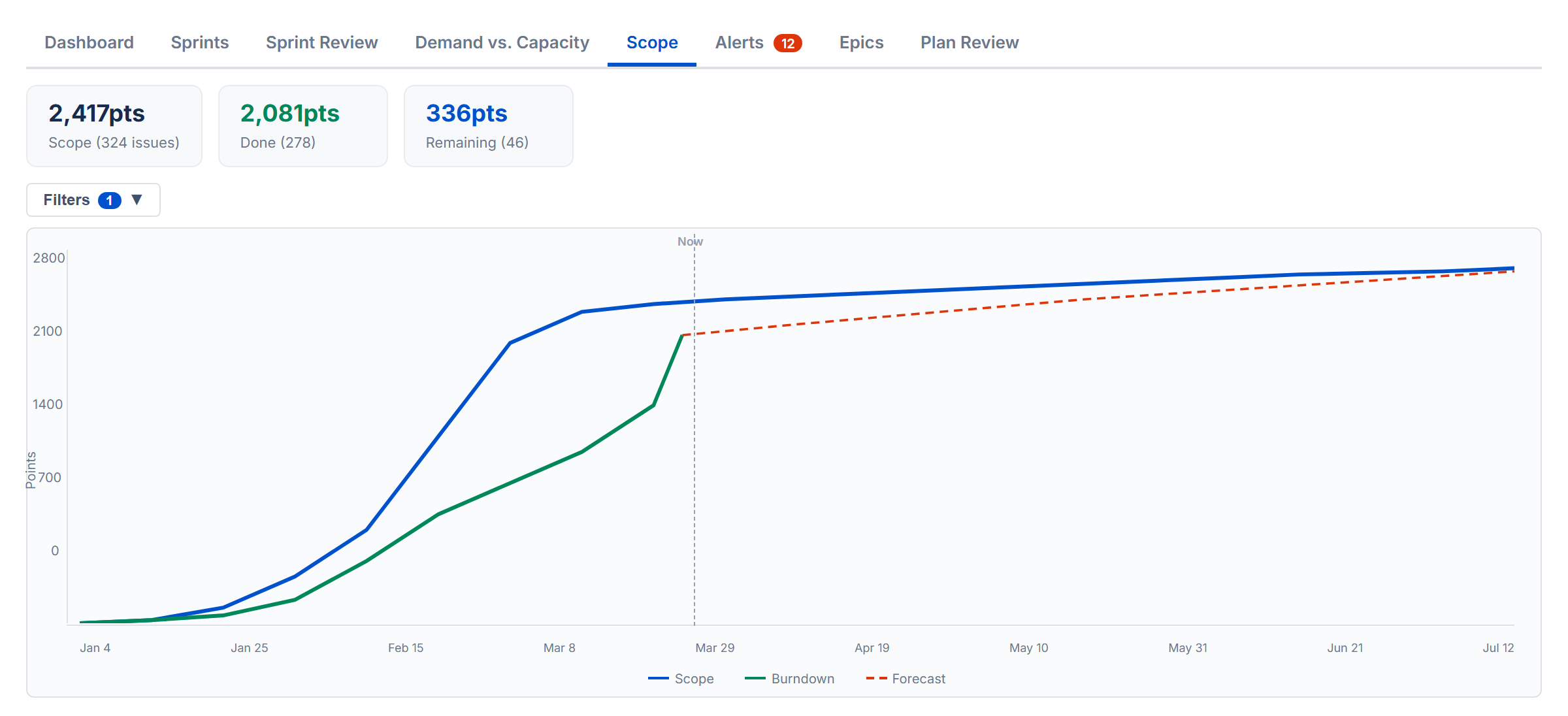
The Scope tab shows how much work has been added over time and how much has been completed, all on one timeline chart. In Points Mode, values are in story points. In Time Mode, values are in hours or days.
The Chart
Two lines tell the story:
- Scope (blue) — cumulative work added over time. As new issues are created or estimates increase, this line goes up.
- Burndown (green) — cumulative work completed over time. This line goes up (not down) as more work is finished. The line stops at the last completed issue rather than extending flat into the future. The gap between the two lines is your remaining work.
- Burndown Forecast (red dashed) — projected completion curve extending into future periods. Appears by default using the Priority strategy.
The chart legend is interactive — click any legend item to show or hide its trace. Hidden items appear dimmed with a strikethrough label.
Delivery Forecast
The Burndown Forecast feature is on by default. When active, the chart extends into the future with projected lines showing when the remaining work will be completed. A toolbar above the chart provides controls:
- Burndown Forecast checkbox — toggle the forecast on or off
- Historical Lookback dropdown — choose how many past periods (sprints or weeks) to include. Only visible when Burndown Forecast is on.
- Strategy pills — select a forecast strategy: Priority (default), Size, Due Date, Balanced, or Velocity (toggle). Each strategy projects a different delivery curve based on how work would be distributed. The forecast line appears in the legend as “Burndown Forecast”.
- Compare All — runs all strategies at once and overlays their forecast lines on the chart for side-by-side comparison. This pill appears last in the row.
Filtering by User
A row of colored user chips appears above the chart. Click a name to filter the burndown line to just that person's completed work. The scope line always shows the total scope. Click a chip again to clear the filter.
Sprint Markers
When Sprint Mode is on, checkboxes let you toggle sprint boundary lines on the chart: solid lines for sprint start dates, dashed lines for end dates. Sprint markers are off by default to reduce visual clutter.
When Sprint Mode is off, sprint marker controls are hidden.
Period Selector
Choose how the timeline is grouped: Weekly, Biweekly, Monthly, or Quarterly. Arrow buttons navigate between periods.
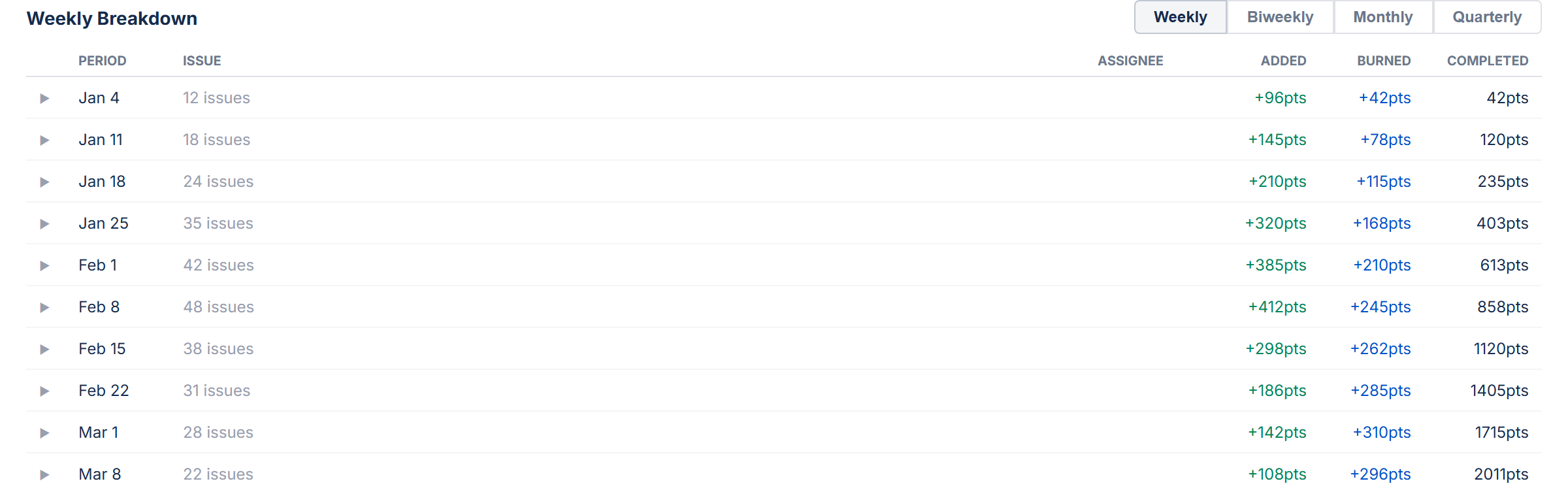
Stat Cards and Breakdown
Below the chart, stat cards show Total Scope, Completed Work, Remaining Work, % Complete, and issue counts. A breakdown table lists individual issues grouped by the selected period.
Demand vs. Capacity Chart
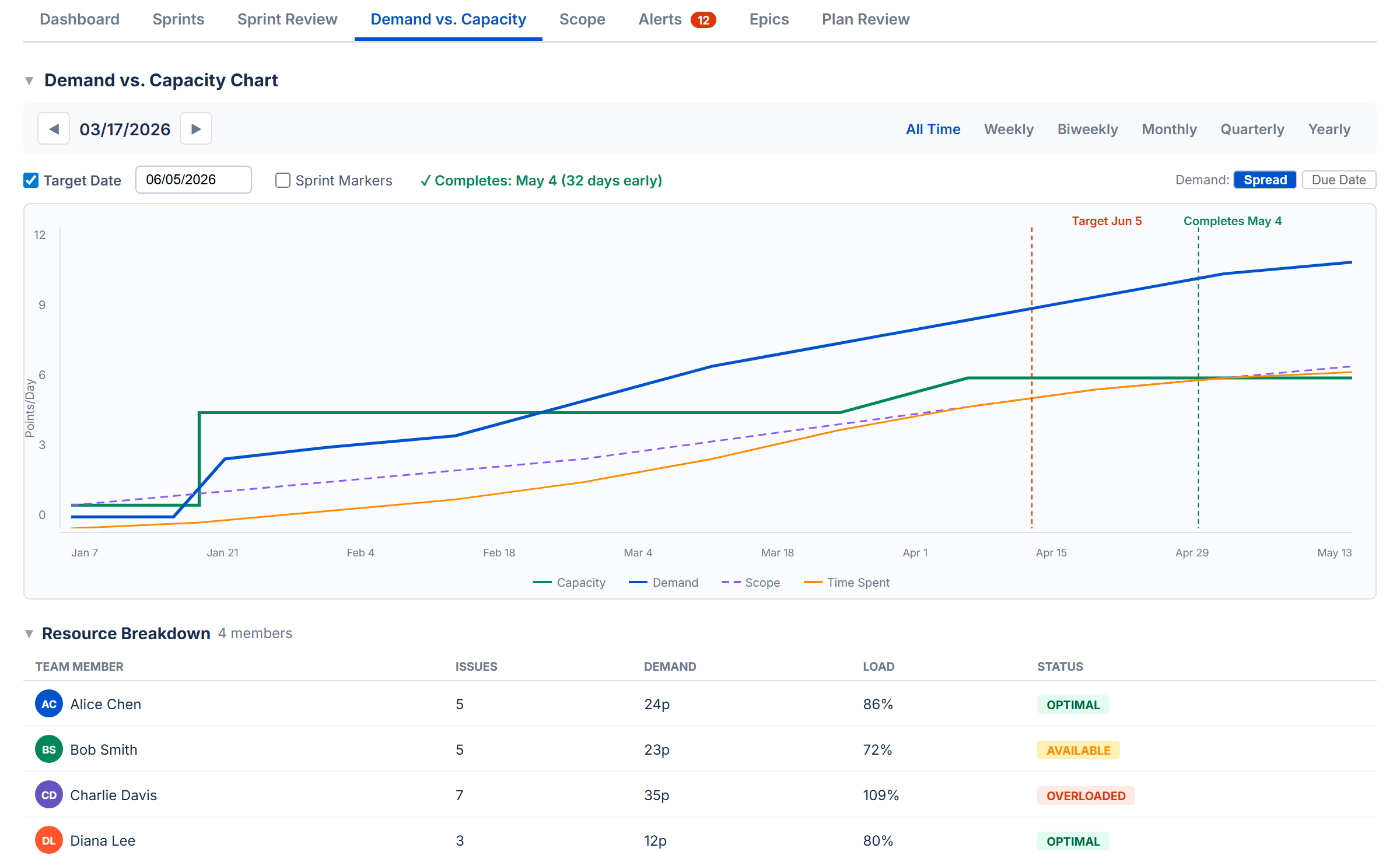
The chart section answers the question: Is your plan achievable? It compares the work you've committed to (demand) against the time or capacity you have available.
Feasibility Score
A score from 0 to 100 that reflects whether you have enough capacity to complete all the work:
| Score | Label | Meaning |
|---|---|---|
| ≥ 80 | On Track | Capacity covers demand with minimal overload periods |
| 50–79 | At Risk | Some periods are overloaded or the buffer is thin |
| < 50 | Infeasible | Significant capacity shortfall |
The score starts at 100% if capacity fully covers demand, then drops based on how many days are overloaded and by how much.
Confidence Score
A separate score that tells you how complete your Jira data is. It averages three things:
- Estimates — what percentage of issues have an estimate
- Dates — what percentage of issues have both start and due dates
- Assignees — what percentage of issues have someone assigned
A low confidence score means the feasibility analysis is based on incomplete data, so its results may be unreliable.
Period Bar
Choose how to slice the analysis: All Time (default), Weekly, Biweekly, Monthly, Quarterly, or Yearly. All Time spans from the earliest start date to the latest due date across your issues. Arrow buttons navigate between periods.
Stat Cards
Seven stat cards give you a complete picture at a glance:
| Card | What It Shows |
|---|---|
| Remaining Demand | Sum of remaining work across all issues in the period |
| Available Capacity | Available capacity for the period |
| Feasibility | The feasibility score (0–100%) |
| Confidence | Data completeness score (0–100%) |
| % Complete | How much of the total work is already done |
| Work Ratio | Remaining demand relative to total estimated work |
| Estimate Accuracy | Time actually spent relative to what was estimated |
Feasibility Chart
A timeline chart showing four lines:
- Cumulative Capacity (green) — how much work your team can handle over time
- Cumulative Demand (blue) — how much work is due over time
- Scope (purple dashed) — cumulative original estimates, showing how scope has grown
- Time Spent (orange) — cumulative time logged
Red-shaded areas highlight overload zones — periods where demand exceeds capacity.
Target Date Forecast
Based on your current pace, the forecast estimates when all work will be completed and how many extra days (if any) are needed beyond the planned end date.
Team Filter and Resource Breakdown
Below the chart, the resource breakdown table shows each person's demand, capacity, load percentage, status badge, and issue count. Click a team member's name to filter the chart and stat cards to just their work.
Sprint Markers
When Sprint Mode is on, checkboxes let you toggle sprint boundary lines on the chart. When Sprint Mode is off, these controls are hidden.
Units
In Points Mode, all values are in story points. In Time Mode, all values are in hours or days (based on your Time Unit setting).
13. Alerts Tab
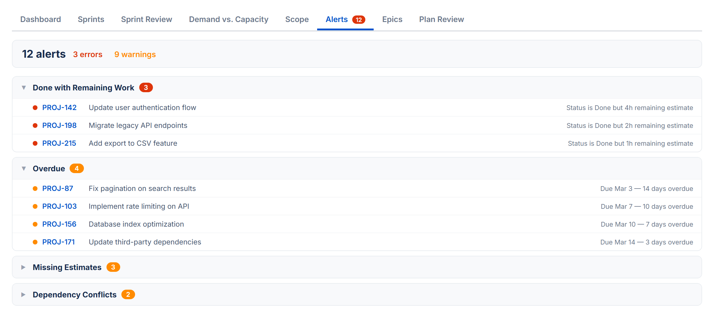
The Alerts tab scans your issues for common problems and analyzes dependency relationships. A badge on the tab shows the total number of alerts found.
Alert Categories
Issues are grouped into six collapsible sections. Click a category header to expand or collapse it:
| Category | What It Catches |
|---|---|
| Done with Remaining Work | Issue is marked Done but still has time remaining on it |
| Overdue | Issue is not Done and its due date has passed |
| Dependency Conflicts | Issue is blocked by something that finishes after it should start. Also detects circular dependencies. |
| Child After Parent | A subtask is due after its parent task |
| Missing Dates | Issue in an active or future sprint has no start date or no due date |
| Missing Estimates | Issue in an active or future sprint has no estimate. In Points Mode this checks for story points; in Time Mode this checks for original estimate. |
Dependency Analysis
Below the alert categories, a collapsible Dependency Analysis section gives you the full picture of blocking relationships:
- Summary — total dependencies, circular dependencies, cross-sprint conflicts, root issues (things that block others but aren't blocked themselves), leaf issues (things that are blocked but don't block anything), and the longest dependency chain
- Dependency list — all blocking relationships, with cross-sprint conflicts highlighted in color
- Conflicts filter — a "Show conflicts only" checkbox to focus on cross-sprint violations
- Root and leaf issues — the top 10 root and leaf issues for quick identification
14. Epics Tab NEW
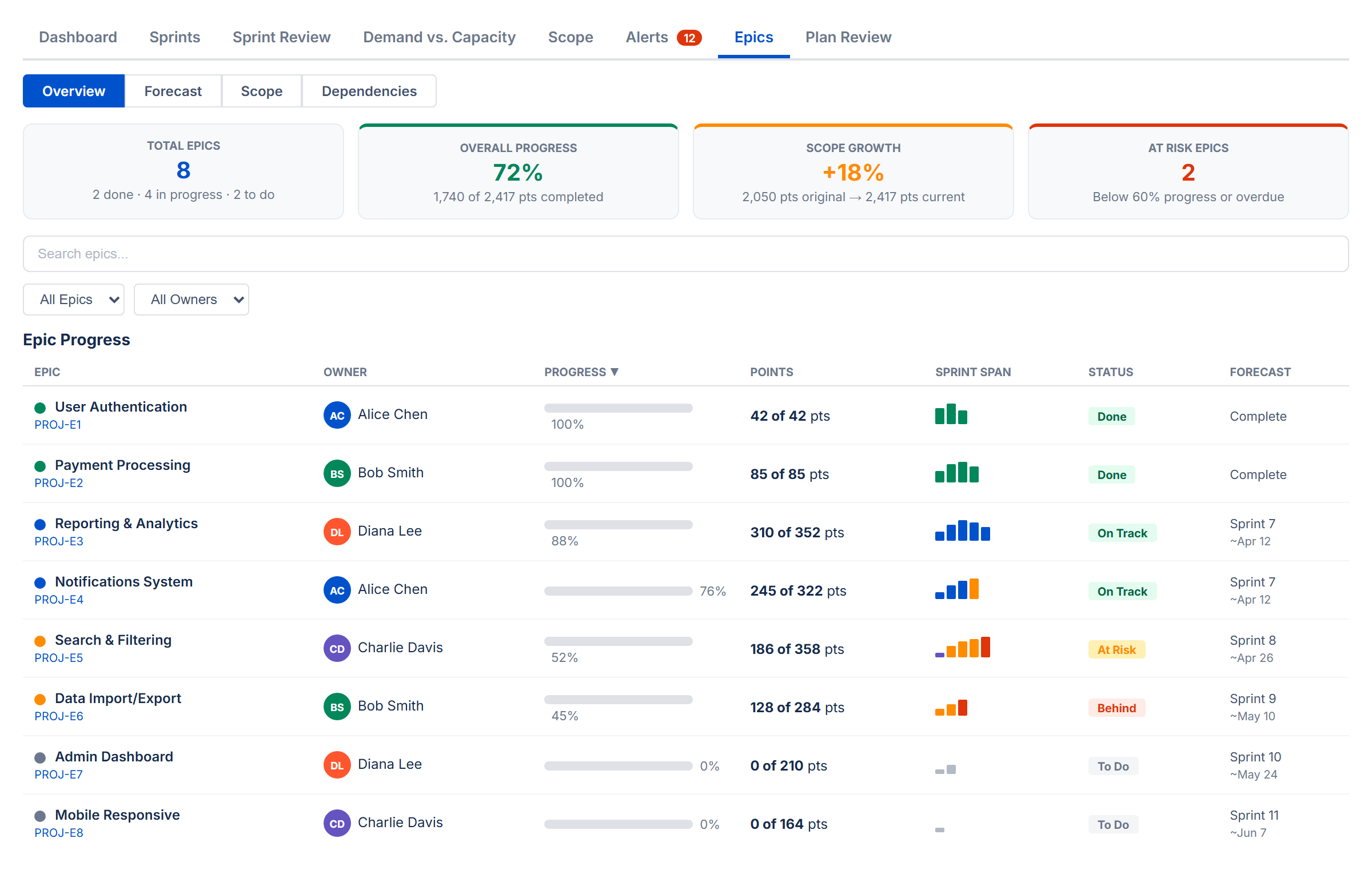
The Epics tab gives you a bird's-eye view of your project organized by epic. It groups all child issues under their parent epics and shows progress, forecasts, scope changes, and cross-epic dependencies — all in one place. It works in both Sprint Mode and non-Sprint Mode.
Four sub-views are available via toggle buttons at the top: Overview, Forecast, Scope, and Dependencies.
Overview
The default view. Four summary cards show the big picture at a glance:
| Card | What It Shows |
|---|---|
| Total Epics | Number of epics found, with a breakdown of how many are in progress, to do, done, and overdue |
| Overall Progress | Percentage of total work completed across all epics (in points or hours depending on your estimation mode) |
| Scope Growth | How much scope has changed since the baseline snapshot. Shows original vs current totals. Dash (—) when scope data is not yet available. |
| At Risk Epics | Number of epics below 60% progress or past their due date |
Filtering and Sorting
Below the summary cards, a toolbar lets you search epics by name or key, filter by status (On Track, At Risk, Behind, To Do, Done, Overdue), and filter by owner. Click any column header in the progress table to sort.
Epic Progress Table
Each row shows one epic with:
- Epic — name and Jira key, with a color dot for visual identification
- Owner — the most frequent assignee across the epic's child issues, shown with an avatar
- Progress — a color-coded progress bar: green (≥ 60%), amber (30–59%), red (< 30%)
- Points / Hours — done work out of total (e.g., "18 of 21 pts")
- Sprint Span (Sprint Mode only) — mini bar chart showing how the epic's work is distributed across sprints
- Status — derived automatically: Done, On Track, At Risk, Behind, To Do, or Overdue
- Forecast (Sprint Mode only) — projected completion sprint and date from Monte Carlo simulation
Click any epic row to expand it and see all child issues with their individual status, assignee, points, and sprint assignment.
How Status Is Derived
| Status | Condition |
|---|---|
| Done | 100% complete or parent issue is in a Done status |
| Overdue | Due date is in the past and not Done |
| On Track | ≥ 60% complete |
| At Risk | 30–59% complete |
| Behind | 1–29% complete |
| To Do | 0% complete or no child issues |
Forecast
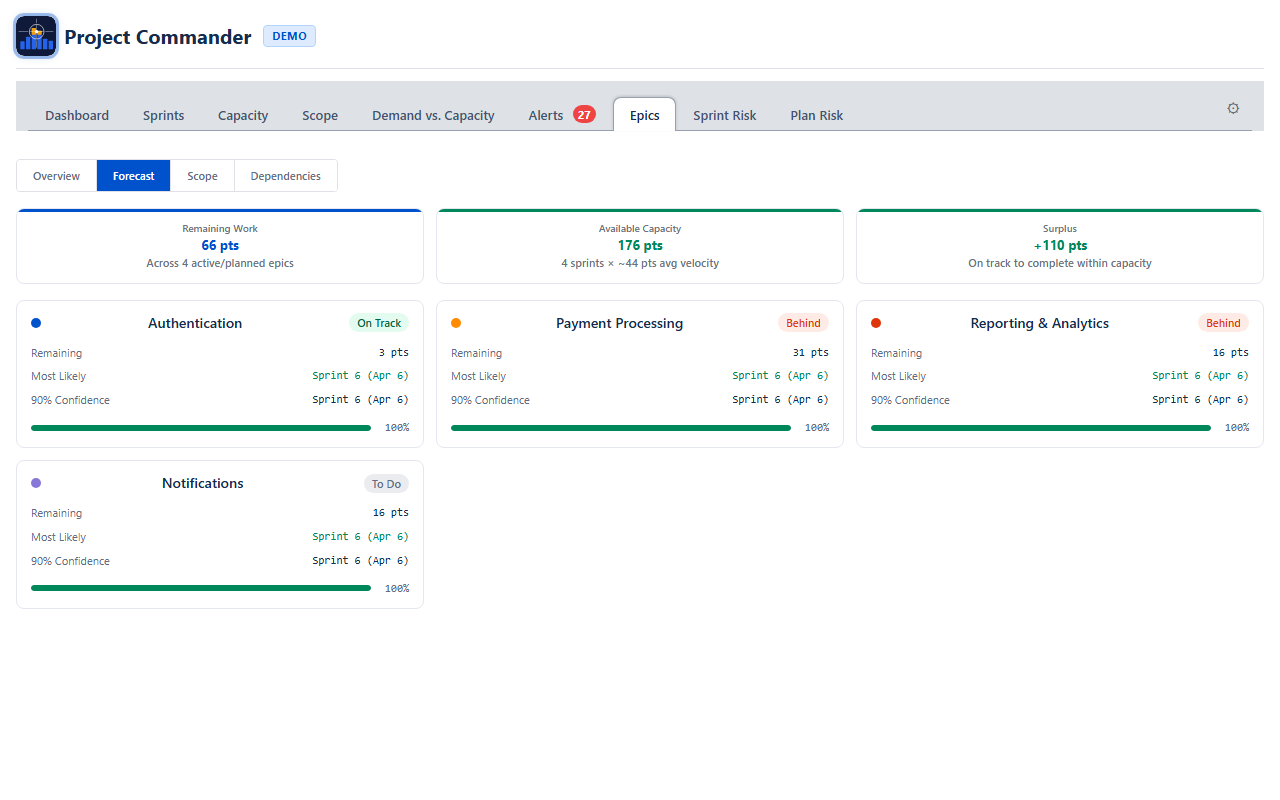
The Forecast sub-view answers: When will each epic be done?
Stat Cards
| Card | What It Shows |
|---|---|
| Remaining Work | Total points or hours not yet completed across all active epics |
| Available Capacity | How much work can be done. In Sprint Mode this is velocity × number of future sprints. In non-Sprint Mode it comes from team capacity analysis. |
| Shortfall / Balanced / Surplus | The gap between remaining work and capacity. Red when work exceeds capacity (shortfall), green when capacity exceeds work (surplus), neutral when exactly balanced. |
When Sprint Mode is off and team members are configured on the Demand vs. Capacity tab, two additional cards appear:
- Feasibility Score — 0–100% score using the same demand-vs-capacity analysis as the Demand vs. Capacity tab. Green (≥ 80%), amber (50–79%), red (< 50%).
- Data Confidence — how complete your issue data is (estimates, dates, assignees). Warnings highlight what's missing.
Per-Epic Forecast Cards
Below the stat cards, each active epic gets its own forecast card showing:
- Remaining — points or hours left for this epic
- Most Likely — the 50th-percentile completion date or sprint from Monte Carlo simulation. Color indicates confidence: green (≥ 80%), amber (50–79%), red (< 50%).
- 90% Confidence — the 90th-percentile date or sprint (90% of simulations finish by this point)
- Confidence bar — visual indicator of forecast tightness. When the p50 and p90 dates are close together, the bar fills fully — meaning the forecast is more certain.
How Forecasts Are Generated
In Sprint Mode, velocity is the rolling average of the last 3 completed sprints. In non-Sprint Mode, velocity comes from team capacity analysis or from historical throughput of completed issues. A Monte Carlo simulation runs 200 iterations with ±30% velocity variance to produce the p50 and p90 estimates.
Scope
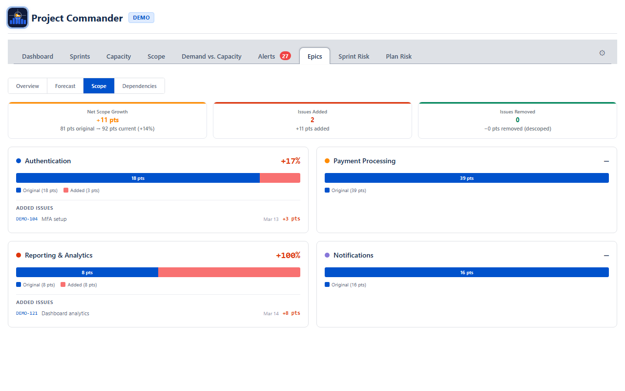
The Scope sub-view tracks how much work has been added to or removed from each epic since the baseline.
Summary Cards
| Card | What It Shows |
|---|---|
| Net Scope Growth | Total change in scope across all epics, with original and current totals. Positive means scope has grown. |
| Issues Added | Count of issues added after the baseline snapshot, with total points or hours added |
| Issues Removed | Count of issues removed (descoped), with total points or hours removed |
Per-Epic Scope Cards
Each epic gets a card showing:
- Stacked bar — blue portion is the original scope, red portion is scope added since baseline
- Change percentage — how much the epic has grown or shrunk. Red for growth, green for reduction.
- Added issues list — when issues have been added, they are listed with their key, summary, date added, and point value
When scope data is not yet available from the backend, per-epic cards show the current scope as a baseline with no change indicator.
Dependencies
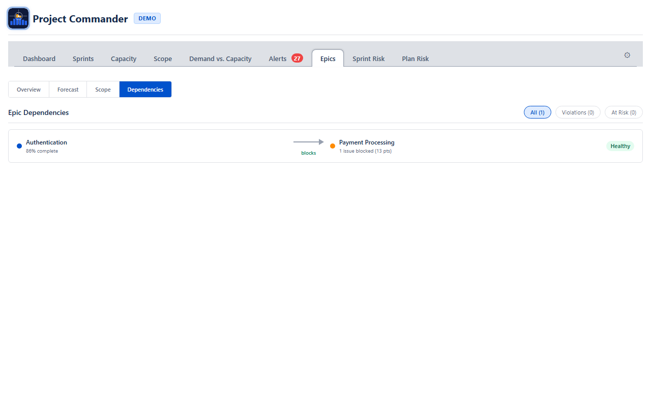
The Dependencies sub-view shows blocking relationships between epics. It only surfaces cross-epic dependencies — blocking within the same epic is filtered out.
Filter Tabs
Three tabs filter the dependency list:
| Tab | What It Shows |
|---|---|
| All | Every cross-epic dependency |
| Violations | The blocker epic is not on track AND blocked issues are not yet done — delivery is at risk |
| At Risk | The blocker epic is not on track but no unfinished blockers are blocking the dependent epic yet |
Dependency Rows
Each row shows the blocker epic on the left, an arrow labeled "blocks" in the middle, and the blocked epic on the right. A status badge indicates the health of the relationship:
- Healthy (green) — blocker is done or on track
- At Risk (amber) — blocker is behind schedule
- Violation (red, dashed arrow) — blocker is behind and its unfinished work is actively blocking dependent issues
Each blocked epic shows how many issues are blocked and their total points or hours.
Estimation Modes
All values in the Epics tab automatically adapt to your estimation mode. In Points Mode you see story points; in Time Mode you see hours. The same applies to capacity, forecasts, and scope calculations.
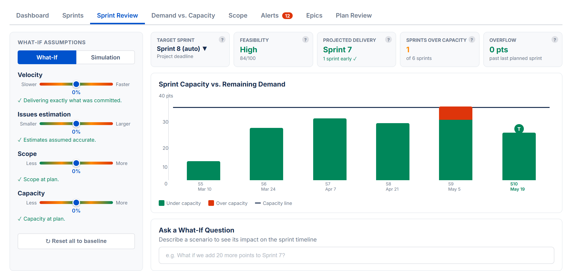
15. Sprint Review
The Sprint Review tab lets you explore "what if" scenarios and run Monte Carlo simulations to understand delivery risk. It requires Sprint Mode to be enabled.
What-If Mode
Four sliders let you adjust planning variables from −50% to +50%:
| Slider | What It Adjusts | Direction |
|---|---|---|
| Velocity | How fast your team works | Positive = team delivers faster |
| Issue Estimation | How accurate your estimates are | Positive = issues take longer than estimated |
| Scope | How much total work there is | Positive = more work gets added |
| Capacity | How much resource is available | Positive = more people or hours |
Velocity and Capacity increase the capacity side (making delivery easier). Issue Estimation and Scope increase the demand side (making delivery harder). The sliders combine multiplicatively — for example, +20% velocity and +10% capacity together give about 32% more effective capacity.
Cascade Bar Chart
Vertical bars show demand per sprint colored by utilization: green (under capacity), amber (overflow from a prior sprint), or red (over capacity). A horizontal capacity line is overlaid on each bar. When any slider deviates from zero, purple dashed ghost bars show the baseline for comparison.
Two vertical markers indicate key milestones:
- T (purple) — Target sprint: the planned delivery deadline
- P (green or red) — Projected delivery: the sprint where all work is expected to complete. Green when on or before target, red when late.
KPI Cards (What-If)
Each card has a tooltip icon (?) explaining its meaning. Hover to see details.
- Target Sprint — the planned delivery sprint (defaults to last sprint with work; changeable via dropdown)
- Feasibility — composite health score (High/Medium/Low) based on delivery timing, overflow, and capacity utilization
- Projected Delivery — the sprint where all work is expected to complete. Green if on target, amber if 1–2 sprints late, red if 3+ sprints late
- Sprints Over Capacity — count of sprints where demand exceeds capacity
- Overflow — remaining work past the last sprint (in points or hours)
Per-Variable Risk Statements
Each slider shows a risk assessment statement below it, describing the impact of that adjustment. For example: "Underperforming. Overflow begins in Sprint 3, completion pushed to Sprint 6."
AI Risk Analysis
In What-If mode, an AI chat panel lets you describe scenarios in natural language (e.g., "What if we lose a developer for 2 sprints?"). This requires an Anthropic API key configured in Settings.
The AI receives your sprint data, issue details, team member information, and assignee workload. It returns slider recommendations (with an Apply button), impact assessment with severity levels, and prioritized recommendations.
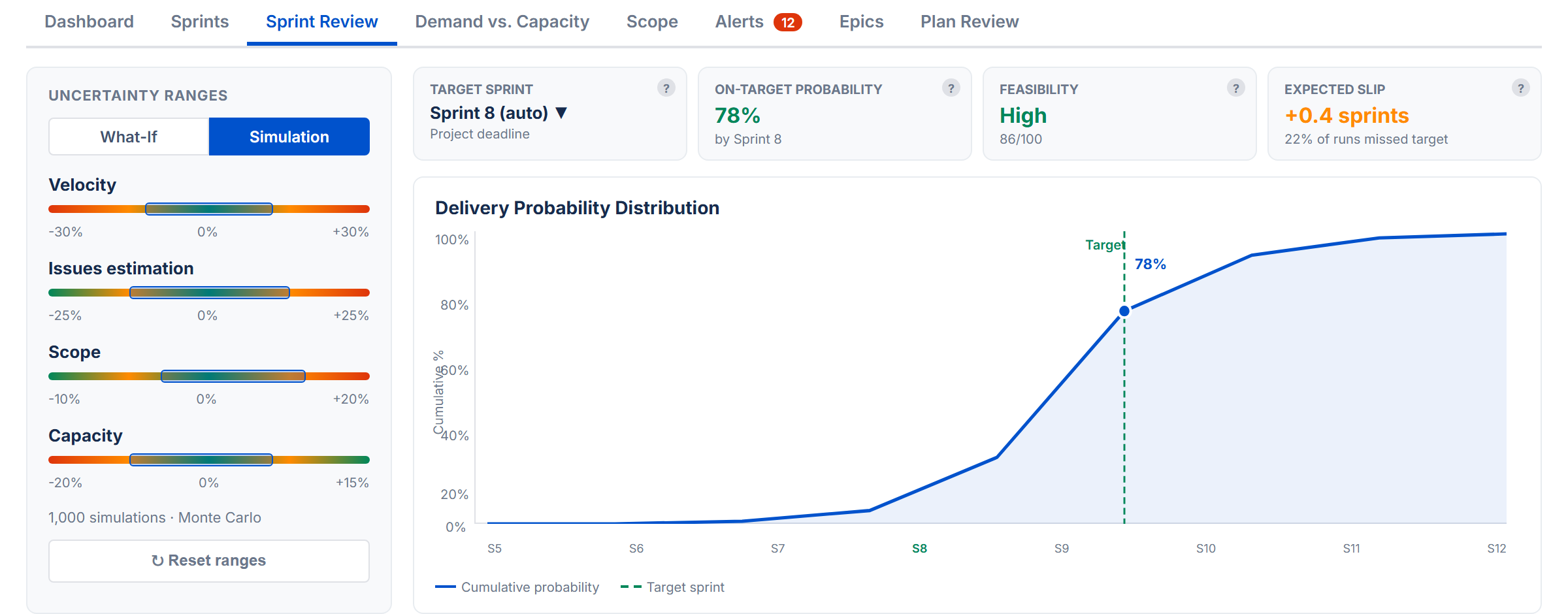
Simulation Mode
Runs 2,000 Monte Carlo iterations to produce a probability distribution of when your project will actually finish. Each iteration randomly varies all four variables within the uncertainty range, simulating real-world unpredictability.
Dual-Dot Sliders
Each variable has a range slider with two dots:
- Red dot (left) — the pessimistic end of the range
- Green dot (right) — the optimistic end of the range
For each of the 2,000 trials, the simulator picks a random value between the red and green dots for every variable. Drag the dots to widen or narrow the uncertainty range. Wider ranges model more uncertainty; tighter ranges model a more predictable project.
S-Curve Chart
A chart showing the cumulative probability of completion by sprint. The x-axis shows sprint names and dates. The y-axis reads "Likely on target." Key markers:
- 80% confidence marker (green dashed) — the point on the curve where there is an 80% probability of completion. The marker sits precisely on the curve.
- Target sprint marker (purple dashed) — the planned delivery sprint, with a label showing the on-target probability percentage (e.g., "72% on target")
KPI Cards (Simulation)
Three equal-width cards appear above the S-curve, each with a tooltip icon (?):
- On-target probability — percentage of simulation runs that finished by the target sprint. Sub-text shows which sprint is the target.
- Feasibility — overall project health (High/Medium/Low) derived from the on-target probability. Updates live as you adjust the sliders.
- Expected slip — average delay past the target for runs that missed it. Sub-text shows what percentage of runs missed the target.
16. Plan Review
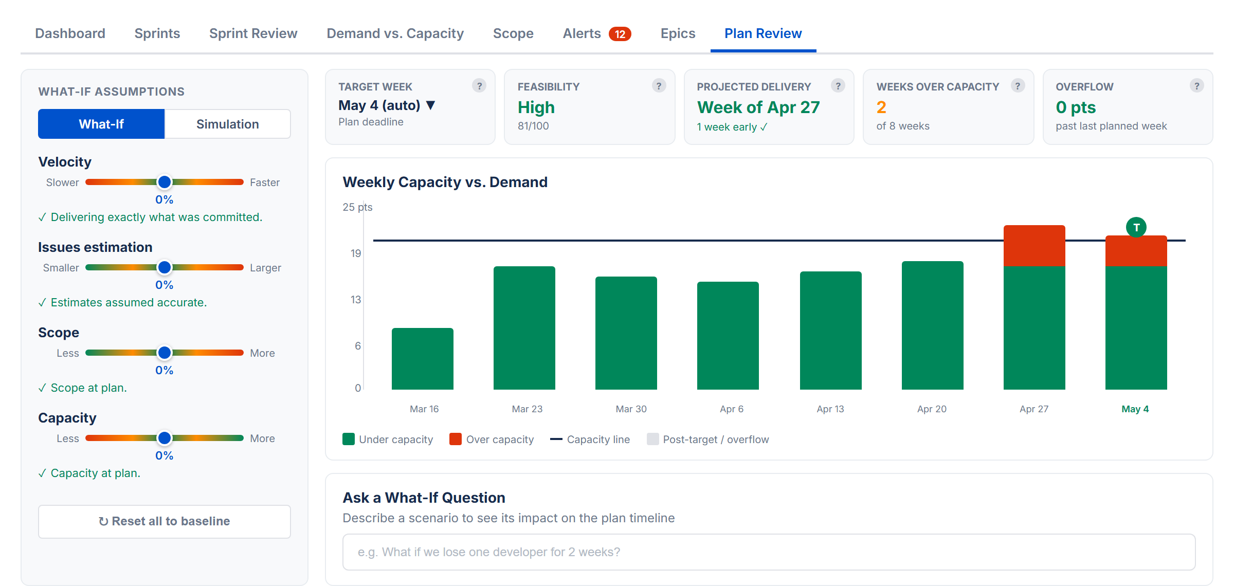
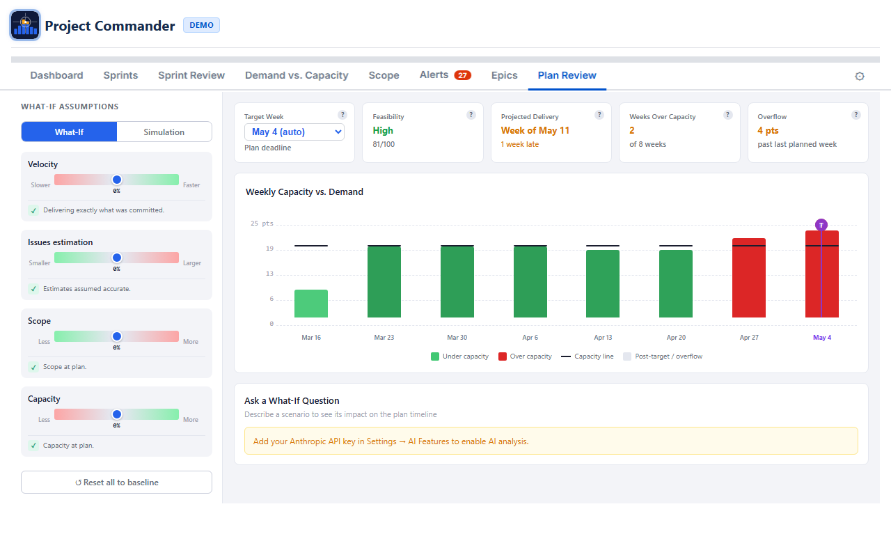
The Plan Review tab provides the same What-If and Monte Carlo analysis as Sprint Review, but works on a weekly timeline based on issue due dates. It doesn't require Sprint Mode or a Board ID — it's always available.
How It Differs from Sprint Review
| Aspect | Sprint Review | Plan Review |
|---|---|---|
| Data source | Sprints from board | Issues with due dates (from JQL) |
| Time buckets | Sprints | Weeks (Monday boundaries) |
| Requires | Sprint Mode ON | Issues with due dates |
| Capacity | Per-sprint capacity | Weekly capacity (holiday and time-off aware) |
| Chart labels | Sprint names | Week dates (e.g., "Mar 10") |
Weekly Data
Plan Review groups issues into weekly time slots based on their due dates. Done issues are excluded from demand. For issues that span multiple weeks (start date to due date), effort is spread proportionally across the weeks rather than lumped into the due-date week. Issues without due dates are excluded. In Time Mode, weekly capacity comes from your team's per-week values on the Demand vs. Capacity tab. In Points Mode, it uses a weekly portion of your Capacity Limit.
If not enough issues have due dates, a message prompts you to add them.
Virtual Overflow Weeks
If the simulation shows work overflowing past the last week that has issues, Plan Review extends the chart with additional weeks to show when the overflow would be completed. These virtual weeks appear with reduced opacity.
What-If, Simulation, and AI Chat
All three features work identically to Sprint Review, with week-based labels instead of sprint numbers. Simulation mode uses the same dual-dot sliders (red pessimistic, green optimistic) and produces the same S-curve, KPI cards, and on-target probability. The AI chat context describes the data as "weekly time buckets based on issue due dates."
17. Estimation Modes
The Estimation Mode setting is the most important choice you make. It determines how work is measured, where capacity comes from, and what units every tab uses. Choose it once and the rest follows automatically.
Points Mode vs Time Mode
| Aspect | Points Mode | Time Mode |
|---|---|---|
| What it measures | Story points | Remaining estimate (hours or days) |
| Where capacity comes from | Capacity Limit from Settings (default), or team Points Per Sprint when Auto is selected | Capacity Limit from Settings (default), or team hours/availability when Auto is selected |
| Capacity Metric | Story Points (set automatically) | Remaining Estimate (locked) |
| Display units | pts | hrs or days (based on Time Unit setting) |
| Time Unit setting | Hidden (not needed) | Visible — choose Hours or Days |
| Progress indicator | Points (done / total) | Estimate (remaining / original) or Work Ratio |
How Each Tab Behaves
Dashboard Tab
All health cards, workload bars, and scope values use story points in Points Mode, or hours/days in Time Mode. The unit label adjusts automatically (pts, hrs, or days).
Sprints Tab
- Points Mode: Each sprint's demand is the sum of story points. The capacity warning and progress bar work in points. When Auto is selected, capacity is calculated from team Points Per Sprint.
- Time Mode: Demand is the sum of remaining estimates, shown in hours or days. When Auto is selected, capacity is calculated from team members' weekly capacity values.
Demand vs. Capacity Tab
- Points Mode: Total capacity shows the sum of each member's weekly points values for the period. Demand shows their assigned story points.
- Time Mode: Total capacity shows the sum of each member's weekly hours values for the period. Demand shows their assigned remaining estimate.
Scope Tab
The scope and burndown chart shows story points in Points Mode, or hours/days in Time Mode.
Demand vs. Capacity Tab
Demand, capacity, and all stat cards use story points in Points Mode, or hours/days in Time Mode.
Alerts Tab
The "Missing Estimates" alert checks for story points in Points Mode, or original estimate in Time Mode.
Sprint Review / Plan Review
The What-If sliders, cascade chart, and Monte Carlo simulation all work in story points (Points Mode) or hours/days (Time Mode).
What Happens When You Switch
Switching Estimation Mode automatically adjusts related settings:
- Switch to Points → Capacity Metric becomes Story Points, Progress Indicator becomes Points
- Switch to Time → Capacity Metric becomes Remaining Estimate (and stays locked), Progress Indicator becomes Estimate
You don't need to change Capacity Metric or Progress Indicator yourself. They follow your Estimation Mode choice.
Time Unit Conversion
Jira stores time in seconds internally. Project Commander uses an 8-hour workday for conversion:
- 16 hours = 2 days
- 40 hours = 5 days (one work week)
When Time Unit is set to Days, all time values throughout the app are shown in workdays instead of hours.
Setting Up Time Mode
- Open Settings and set Estimation Mode to Time
- Go to the Capacity tab
- Add your team members and set their weekly capacity (Hrs/Wk or Pts/Wk)
- Add any Company Holidays (for reference)
- Use the Time Off calendar to track PTO, then adjust weekly capacity as needed
- Sprint capacity will now be automatically calculated from your team's weekly values
Points Mode vs Time Mode — the key difference
Estimation Mode controls which Jira field measures work (story points vs remaining estimate). In both modes, each sprint's Default/Team/Manual toggle determines where capacity comes from — see How Capacity Works. The difference is what Team calculates in Per User mode: in Points Mode it sums weekly points values; in Time Mode it sums weekly hours values for the sprint's date range.
18. Dependencies
Project Commander detects blocking relationships from Jira's "blocks" and "is blocked by" issue links. Dependencies affect multiple features across the app.
Where Dependencies Appear
Sprints Tab
Issues with dependency conflicts show a warning icon (⚠) next to their key in the issue table. The icon has a tooltip describing the conflict (e.g., "Blocked by PROJ-45 which ends after this issue starts").
Alerts Tab
The Dependency Conflicts alert category lists all issues where a blocker finishes after the blocked issue should start. The Dependency Analysis section provides the full dependency graph with summary stats, edge list, root/leaf issues, and a conflicts-only filter.
Dependency Map Modal
Click the Dependencies button in the action header to open a modal with three tabs:
- All — every blocking relationship across all sprints
- Cross-Sprint — only dependencies that span different sprints
- Violations — only dependencies where the blocker is in a later sprint than the issue it blocks
Each dependency shows the blocker and blocked issue with their sprint name, sprint state badge (active/future), and completion status. Violation rows are marked with a warning icon.
Auto-Level
Auto-Level always respects dependencies. A blocking issue is placed in an earlier (or same) sprint as the issues it blocks. If circular dependencies exist, they are detected and reported, and the affected issues are still placed using the chosen strategy.
19. Troubleshooting
App shows "Loading..." indefinitely
- Check that your JQL filter is valid. Try running it directly in Jira's issue search.
- If Sprint Mode is on, verify the Board ID is correct (check your board URL).
- Ensure the Forge app has the necessary permissions on your Jira site.
No sprints appear on the Sprints tab
- Confirm Sprint Mode is enabled in Settings.
- Verify the Board ID matches a Scrum board.
- Check that the board has at least one sprint created.
Drag and drop is not working
- Ensure the issue is not locked (lock icon should be unlocked).
- If reordering within a sprint, make sure no column sort is active (click the sorted column header to clear it).
- Browser extensions that intercept drag events may interfere.
Changes are not saving
- After editing settings, click Save Configuration. The button shows "Saving..." and then "Saved!" on success.
- Check your browser console for errors if the save fails silently.
Dependency warnings are missing
- Dependencies require "blocks" / "is blocked by" link types in Jira. Other link types (relates to, duplicates) are not tracked.
- Check that the linked issues are included in your JQL filter or board.
Velocity section is empty
- Velocity requires completed sprints. Use Import from Completed Sprints to backfill historical data.
- Velocity data loads only when you are on the Sprints tab. Switch to that tab and wait for it to load.
Wrong demand values in Points Mode
- Demand sums the story points of all non-done issues. If issues are missing story points, they contribute 0 to demand.
- Check the Missing Estimates category on the Alerts tab to find issues without points.
Capacity shows 0 in Time Mode
- Time Mode calculates capacity from team members' weekly values on the Demand vs. Capacity tab. Add at least one team member and set their Hrs/Wk.
- Check that the sprint has valid start and end dates (capacity is summed from the weekly values that overlap the sprint).
- If you see zero capacity, make sure weekly values are set for the weeks that overlap your sprint dates.
AI analysis not working on Review tabs
- An Anthropic API key is required. Go to Settings → AI Features and enter a valid key.
- The key should start with
sk-ant-.
Plan Review shows "Issues Need Due Dates"
- Plan Review requires issues with due dates to build weekly time buckets. Add due dates to your issues in Jira.
20. Technical Reference
Visual Indicators
| Indicator | Meaning |
|---|---|
| Default button highlighted | Sprint uses capacity limit from Settings |
| Team button highlighted | Per User mode: capacity calculated from team config. Per Sprint mode: same as Default. |
| Manual button highlighted | Sprint capacity is a user-entered number |
| Team button greyed out | No team members configured on the Demand vs. Capacity tab |
| Red avatar ring | User is over their capacity limit |
| Green avatar ring | User is within capacity |
| Gray avatar | User is filtered out — click to restore |
| Purple move badge | Issue was moved by Auto-Level |
| Orange move badge | Issue was manually moved during an Auto-Level session |
| ⚠ icon on issue key | Dependency conflict (blocker finishes after this issue starts) |
| Lock icon (filled) | Issue or sprint is locked (excluded from Auto-Level and drag) |
| Blue sort arrow (↑/↓) | Column is sorted ascending or descending |
| Blue reorder line | Drop target indicator when reordering issues |
| Red due date | Issue is past due (due date before today) |
| T marker (purple) | Target sprint/week on cascade bar chart |
| P marker (green/red) | Projected delivery sprint/week on cascade bar chart |
Keyboard and Mouse Shortcuts
| Action | Shortcut |
|---|---|
| Select multiple issues | Click checkboxes individually |
| Select a range of time off days | Shift + click |
| Toggle individual time off days | Ctrl + click |
| Close column search dropdown | Esc |
| Add column from search | Enter |
Data Storage
Project Commander stores all its data securely within your Jira Cloud instance using Atlassian Forge storage:
- Configuration — all settings, column preferences, sprint limits, per-sprint capacity overrides, locked issues, locked sprints
- Team configuration — team members, weekly capacity values, holidays, time off
- Issue orders — custom issue ordering per sprint
- Velocity data — historical sprint completion data
Issue data from your JQL filter is fetched from Jira on each page load and shared across all tabs. No issue data is stored permanently by the app.
Time Unit Conversion
Jira stores time values in seconds. Project Commander converts using an 8-hour workday:
- 1 hour = 3,600 seconds
- 1 day = 28,800 seconds (8 hours)
Capacity States
Each sprint's Default/Team/Manual toggle determines its capacity source:
| Toggle State | Source |
|---|---|
| Default selected | The Capacity Limit from Settings |
| Team selected | Per User mode: calculated from team configuration (Points Mode: points per sprint; Time Mode: available hours minus holidays and time off). Per Sprint mode: same as Default. |
| Manual selected | The number the user entered |
During Auto-Level, a "Use velocity as capacity" checkbox can override these with efficiency-adjusted limits based on each member's historical completion rate against their real available capacity.
Risk and Demand vs. Capacity tabs always use team-based calculations when available, regardless of individual sprint toggles. They fall back to the Capacity Limit from Settings when no team is configured.
Auto-Level Constraints
- Maximum 10 new sprints per Auto-Level run
- New sprint dates use the Sprint Length setting (2, 3, or 4 weeks) with contiguous scheduling
- New sprint capacity defaults to the average of existing sprint capacities
- Oversized issues (larger than sprint capacity) are placed in a dedicated overflow sprint
Monte Carlo Simulation Details
- 2,000 iterations per simulation run
- Each iteration varies all four risk variables randomly within the range defined by the dual-dot sliders (red to green)
- Results are binned at half-sprint (or half-week) precision for smooth probability curves