 Project Commander Docs
← Back to site
Project Commander Docs
← Back to site
Dashboard Tab — Feature Guide
What it's for
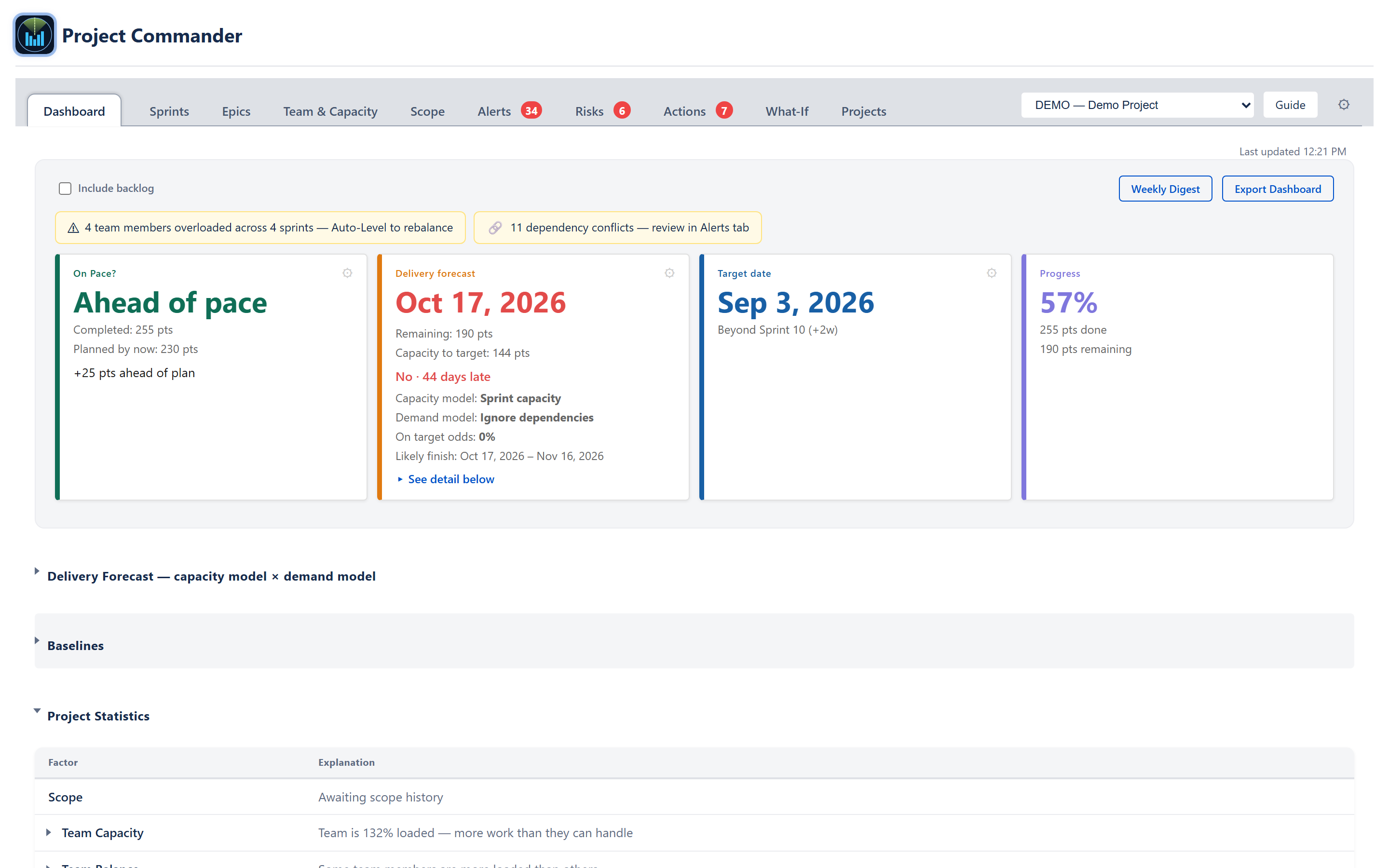
The Dashboard is the project's single-screen health view. It collapses the full state of the project — schedule, scope, team capacity, data quality, delivery confidence — into four big stat cards across the top, a Project Statistics scorecard, a Velocity History sparkline, an AI Insights section, and a Top Open Risks list. Every number on the Dashboard is computed by the same shared utilities the Sprints, Scope, Risks, and Plan-Risk tabs use, so a verdict here will match the verdict on any other tab.
The audience is the project lead, delivery manager, or stakeholder who needs the answer to one question — Are we on track to hit the deadline? — and a quick path into whichever tab can answer the follow-up. Banner pills at the top of the tab link directly into Auto-Level (when capacity overload is detected), into Alerts (when dependency conflicts are detected), and into the Project AI assistant (for narrative analysis).
Header / Toolbar

Include backlog checkbox
A single checkbox sits at the top-left of the panel (in sprint mode). Unchecked, the Dashboard counts only issues that are in a sprint plus all done issues. Checked, it adds in everything that matches the project's JQL filter, including unscheduled backlog work. Every downstream number recomputes when this toggles — stat cards, diagnostics rows, AI insights, forecast date. The choice is saved to the project's configuration, so it persists across reloads.
Weekly Digest button
Opens a modal that previews an email-ready summary of the current Dashboard state — stat cards, top alerts, recent throughput, scope growth, risks. From the modal the user can export a PDF or close it. The preview is a snapshot at the moment the button was clicked; it does not auto-update if the underlying data changes while the modal is open.
Export Dashboard button
Generates a single-file PDF report of the Dashboard with interactive controls stripped out. The PDF includes the four stat cards, the Project Statistics table, Velocity History, and Top Open Risks. The export honours the current Include-backlog state and the current values of the per-card settings. The file is named dashboard-report-YYYY-MM-DD.pdf.
Capacity Overload banner
Appears when one or more team members are projected over 100% utilisation across one or more open sprints. Reads "N team members overloaded across M sprints — Auto-Level to rebalance" with a yellow ⚠ icon. Clicking the banner navigates to the Sprints tab and opens the Auto-Level preview.
Dependency Conflict banner
Appears when the Alerts engine has detected one or more dependency conflicts (blocker due after blocked, blocker after dependent start, circular dependency). Reads "N dependency conflicts — review in Alerts tab" with a 🔗 icon. Clicking the banner navigates to the Alerts tab.
External Deadline banner
Appears when one or more issues have an external (locked) due date and are scheduled in a sprint that ends after that date. Reads "N externally-constrained issues at risk of missing their deadline" with a 📅 icon. The banner is informational and does not link out.
Settings cog
A settings cog sits at the top-right; it opens the global Settings panel.
Last updated
A Last updated HH:MM line sits at the top-right of the tab once data has been fetched, so the freshness of the numbers is always visible.
Stat cards

Four cards across the top — On Pace?, Delivery Forecast, Target Date, Progress — each with a primary value and secondary lines. Three of them carry a gear that opens a settings panel beneath the cards: the Delivery Forecast card's gear is its own (the two model pickers + scope growth), and the On Pace? and Target Date gears open their shared settings. Progress has no gear. When the settings panel is open the row reflows to give the Delivery Forecast card extra width.
On Pace? card
Shows whether earned work to date is ahead of, on pace with, or behind the planned amount of work for today. The headline reads Ahead of pace, On pace, or Behind pace depending on the result.
- Primary label: Ahead (green), On pace (green), or Behind (red).
- Line 1: Completed: X pts — sum of estimates on done issues.
- Line 2: Planned by now: Y pts — sum of estimates on issues whose due date is on or before today.
- Footnote: signed delta (e.g., +30 pts ahead of plan).
- Bands: |delta| ≤ 5% of planned → On pace; > 5% → Ahead or Behind.
- Settings: a checkbox — Include All Done, not only planned, which starts CHECKED each session (every Done issue counts by default; the choice is not saved). When unchecked, only Done issues whose due date is on or before today are counted in Completed. Plus a Pace measure radio: Auto (timeline if no due dates set, schedule otherwise), Timeline-based (project timeline elapsed × total scope), or Schedule-based (sum of estimates on issues due by today).
- The earned-value SPI value is computed by the underlying engine but is not currently rendered as a separate metric on this card; the Ahead / On pace / Behind verdict and the signed delta are the user-facing surface of the same comparison.
Delivery Forecast card
Shows the projected end date for all remaining work against the target date.
- Primary value: a date (e.g., Jul 13, 2026), or one of two terminal labels — Complete when no work remains, or Never when work remains but the plan can't deliver it (no capacity, or scope growing at least as fast as the team burns it down). (Unlike the Target Date card, this card shows no sprint-name line beneath the date.)
- Line 1: Remaining: X pts — sum of estimates on non-done issues.
- Line 2: Capacity to target: Y pts — total capacity between today and the target date, clipped at BOTH ends: the active sprint contributes only its remaining day-fraction (days already elapsed are spent — ruling 2026-07-10), and a sprint that straddles the target contributes only its share of days on or before it (ruling 2026-07-09). When the plan holds capacity beyond the target (the rest of a straddling sprint, or open sprints starting after it), an extra line states it: N pts capacity available after target date.
- Status line: On target (green), At risk (amber, within a week late), or Not on target · N days late (red).
- Capacity model and Demand model caption — names the pair currently driving the date.
- Amber notices under the caption when supply-side data is missing: Efficiency assumed — no completed-sprint history yet (Effective model with no measured efficiency), and Team capacity reads 0 — no per-sprint capacity is calculated yet. Check sprint dates and the Team & Capacity tab. (Team or Effective model resolving to zero capacity while work remains — the explanation for a "Never" date with capacity 0).
- On target odds and Likely finish — the chance of making the target and the optimistic-to-pessimistic finish range, from a Monte-Carlo run of the plan (Critical Chain carries no odds — it's a floor, not a prediction).
- Settings (the gear): a Capacity model dropdown — Sprint capacity, Effective capacity, Team capacity, Velocity (with sprints on; only Team capacity and Effective capacity with sprint mode off, since Sprint capacity and Velocity both need sprints). Choosing Velocity reveals a use last N sprints input. A Demand model dropdown, in this order — Ignore dependencies, Respect dependencies, Critical Chain only, Resequence work. And a Scope growth method control — off by default; turned on, choose Average (the project's own historical rate) or Manual (a rate you type). Each model is documented in ALGORITHMS.md (Delivery Forecast).
Target Date card
Shows the deadline the rest of the Dashboard is measuring against. Always blue (no status colour).
- Primary value: the resolved target date.
- Below the date: the matching sprint name when the target lands inside a planned sprint, or Beyond Sprint N (+gap) when the target is past the last planned sprint. The gap tail adapts to its size — (+Nd) for a gap of two weeks or less, (+Nw) for weeks, (+Nmo) for months past the last planned sprint's end.
- Settings: two radio buttons — Latest issue due date (the default; picks the latest due date across non-done issues) or Fixed date (a date picker for explicit override).
Progress card
Shows the overall percentage complete. Always purple.
- Primary value: a percentage (57%).
- Line 1: X pts done.
- Line 2: Y pts remaining.
- No settings panel and no gear icon.
- Calculation: sum of estimates on done ÷ sum of estimates on all (done + non-done). When no estimates exist the formula falls back to done count ÷ total count.
Delivery Forecast — capacity model × demand model
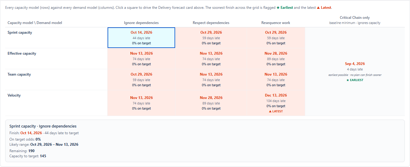
A collapsible section beneath the four stat cards (open it with the card's "See detail below" link or the section header) that answers "when will this finish, and what changes the answer?" by showing every capacity model × demand model pairing at once in one grid.
- Rows are the capacity models: Sprint capacity, Effective capacity, Team capacity, Velocity (only Team and Effective when sprint mode is off).
- Columns are the demand models: Ignore dependencies, Respect dependencies, Resequence work, and Critical Chain only — shown once as a single merged column on the right, the baseline-minimum floor (the earliest the blocking chain alone allows; it ignores capacity, so it carries no odds).
- Each cell shows its finish date, its gap to target (on target / N early / N late), and its on-target odds, and is shaded green / amber / red by those odds. The soonest finish across the grid is flagged ★ Earliest and the latest ▲ Latest.
- Clicking a square sets that pairing everywhere — it drives the Delivery forecast card above, and the demand model is a shared choice with the Scope and What-If tabs.
- A detail panel below the grid explains the selected pairing: its finish, gap to target, on-target odds, likely range, and the two supporting numbers for that work order (e.g., blocking links, tasks moved, the longest chain).
The four demand-model dates stay physically consistent: the dependency-respecting orders never read earlier than the Critical Chain floor, and Respect dependencies never reads earlier than Ignore dependencies. In the program (all-projects) view the grid rolls up per project — each project on its own team's capacity (with that project's allocation applied) — so the program finishes with its slowest project and the capacity model reads Per project.
Baselines

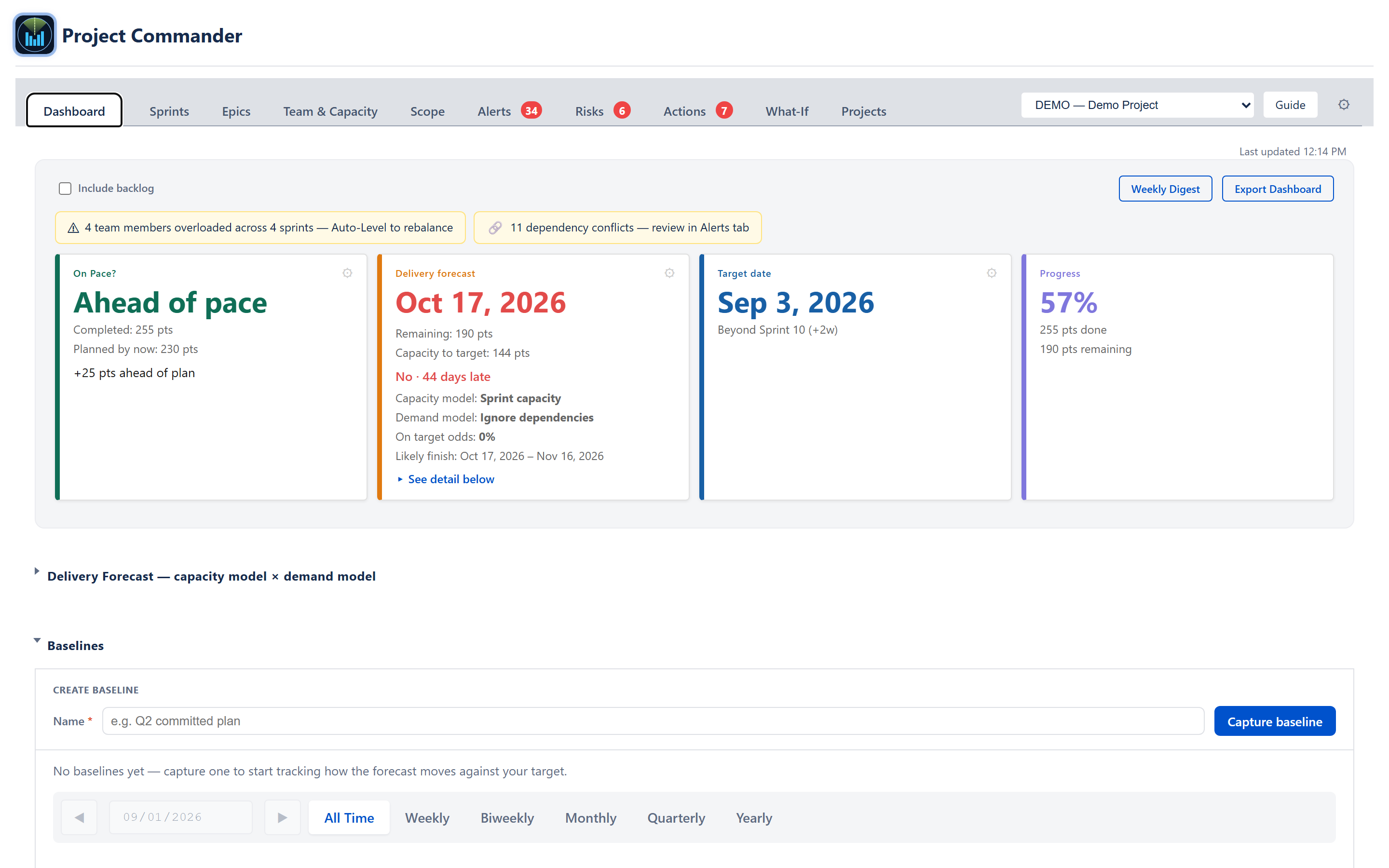
A collapsible section for capturing named snapshots of the plan and watching how the forecast moves over time.
A capture bar (type a name, press Capture) freezes the current plan. Each snapshot appears on a timeline — one row per baseline, with its forecast and target marked, and a period picker (All Time, Weekly, Biweekly, Monthly, Quarterly, Yearly) focuses the timeline on any stretch of dates — and in a table with captured date, target, delivery forecast, slip vs target, scope, capacity, issues, sprints, velocity, open risks, and open alerts. Slip is how far a baseline's forecast lands before or after its target; hovering a row breaks the slip out against every earlier baseline, with the scope and capacity behind each change.
Snapshots are frozen — later data changes never alter a saved baseline — and are saved in Atlassian cloud storage, kept separately per project and per program. Saved baselines can be renamed or deleted inline (delete asks first); the live "Current" row cannot. The delivery forecast a baseline records follows whichever demand model is selected in the Delivery Forecast section above.
Project Statistics

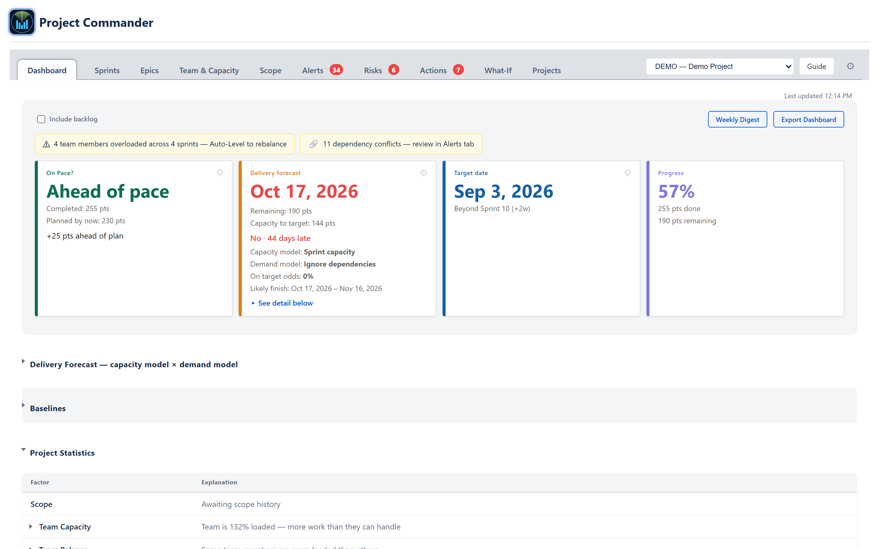
A collapsible scorecard. Each row is a factor with a one-line explanation, and an expand caret that opens a detail block listing the specific issues, sprints, or members that produced the verdict.
The visible Project Statistics rows are the Health factors plus the Quality / data factors. The Schedule factors (On Track, Sprint plan based, Team velocity based, Schedule Performance, Completion %, Work Ratio, Can We Deliver?) are computed by the same engine but folded into the Stat Cards above (On Pace?, Delivery Forecast, Target Date, Progress) — they are deliberately filtered out of the visible scorecard so the cards and the table never disagree.
Health block (group: health, visible in Project Statistics)
- Scope — has scope grown since project start, and how fast?
- Team Capacity — the project-wide load ratio (e.g., Team is 132% loaded): remaining work ÷ capacity between today and the target date. The active sprint contributes only its remaining day-fraction of capacity (ruling 2026-07-10), so the ratio doesn't relax mid-sprint as if the elapsed days were still available.
- Team Balance — variance in load between team members. Each member's load % is their remaining work ÷ their remaining capacity (the share of the analysis window still ahead of today — ruling 2026-07-10); the expanded detail lists both the remaining and the full capacity per member.
- Commitment vs Delivery — completion rate across recent sprints, with trend (improving / stable / declining).
- Estimate Accuracy — actual time vs. original estimate on done work.
Quality / data block (visible in Project Statistics)
- Dependency Conflicts — count of blocker-ordering conflicts (a blocker scheduled after the work it blocks). Child-after-parent and circular dependencies are counted under the Alerts row, not here. Click to jump to the Alerts tab.
- Alerts — count of error- and warning-severity items emitted by the alerts engine.
Schedule block (computed but folded into stat cards)
- On Track — parent verdict that drives the On Pace? card.
- Sprint plan based (sprint mode only) — does the planned sprint plan reach the target date?
- Team velocity based — does the rolling-velocity forecast reach the target date?
- Schedule Performance — earned-value SPI to date.
- Completion % — done estimate ÷ total estimate (drives the Progress card).
- Work Ratio — work hours done vs. estimated.
- Can We Deliver? — terminal yes/no derived from forecast vs. target (drives the Delivery Forecast footnote). Its capacity side is the same today-to-target sum as the Team Capacity row: the active sprint counts only its remaining day-fraction.
Status classification
The table itself has no status column or colour dot — each row shows only the factor name and its plain-English explanation. The underlying classification still exists: overall health bands (excellent 85, healthy 70, at-risk 55, concerning 40) and per-factor thresholds (OK / Caution / At Risk / Unknown) still apply behind the scenes. That classification no longer renders as a dot here, but it still shapes the wording of each explanation and drives the severity-aware tone of the AI Insights section.
Detail rows
Clicking a factor's row toggles its expand area. The detail can be a list of issues (linked to Jira), a list of sprints, a list of members, or a short explanation of the threshold that fired. Detail text is sanitised — only basic formatting (bold, line breaks, and lists) is allowed.
Per-row tooltips
Each factor name has a hover tooltip with the metric definition and threshold table.
AI Insights
A collapsible section that runs the same AI provider used elsewhere in the app and produces a narrative analysis of the visible factors plus a chat box for follow-ups.
Auto-fire when the factors change
The section watches the visible factors — their status and explanations — and remembers what it last saw for the current browser session. When that changes (a factor turns red, an explanation updates, or a factor is added or removed), the section re-fires an AI call automatically. No button click is required.
Severity-aware tone
The prompt includes a tone-guide line that switches based on the count of red factors:
- 0 red → balanced, factual.
- 1–2 red → direct but measured; identify the specific constraint.
- 3+ red → direct and specific; do not catastrophize.
Two grouped output sections
The model returns bulleted text. The app classifies each bullet by keywords (scope / capacity / delivery / estimation / etc.) and groups them under Project Status and Team & Plan Health. A separate Recommendations list sits below.
Expandable bullets
Clicking any bullet either reveals inline detail (when the model already provided a DETAIL: line) or fires a follow-up AI call asking "Give more detail on this specific point". The expanded text appears beneath the bullet.
Follow-up chat
Below the bulletted output, a textarea + Ask button accepts free-form questions. The chat is multi-turn: every earlier question and answer in the session is sent along as running conversation history, so a follow-up like "and what about the second one?" is understood in the context of what was already asked. The current question is also given the factor block so the model always sees the live project numbers. This running history is kept only for the current project and sprint — switching project or sprint clears it and the next question starts a fresh conversation. If the model's response includes suggested slider values, the app appends a plain-text line — Open the What-If tab to explore this scenario interactively — naming them.
No-key state
When no AI provider/model/key is configured, the section shows Turn on AI Insights in Settings: choose an AI provider, pick a model, and add your API key. — and the rest of the AI Insights panel (the analysis, the bullets, and the follow-up chat) is not rendered at all, rather than shown-but-disabled.
Velocity History sparkline
Visible in sprint mode with at least two closed sprints. Hidden in Program-All mode.
- One bar per recent closed sprint (default 8).
- Last sprint's bar is darker; earlier sprints lighter.
- Dashed horizontal overlay shows the rolling average velocity.
- Trend label: ▲ Improving, ▬ Stable, ▼ Declining, based on whether the most recent sprint sits more than ±10% of the average above or below the oldest sprint shown.
- Right-side readout: total committed in the active sprint, shown in normal dark text up to 105% of average, amber at 105–115%, red above 115%.
- Hovering a bar shows a tooltip with the sprint name and points completed.
Top Open Risks widget
Lists the highest-severity open risks across the project regardless of source — manual risks, accepted AI suggestions, and any deterministic-detector output that has been promoted into the register. Each card shows the severity score, scope chip (e.g., PROJECT · DEMO), the response strategy chip (UNDECIDED / AVOID / MITIGATE / TRANSFER / ACCEPT / ESCALATE / DEFER), the risk title, the owner, and an action progress line (N/M actions done). Clicking a card navigates to the Risks tab pre-scrolled to the matching item.
Above the cards the header shows the open count and the critical count (e.g., 6 open · 3 ⚠ — the warning figure counts critical-severity open risks only, not high), plus a strategy mix bar (e.g., "3 undecided · 4 mitigate · 2 accept · 1 escalate", rendered in that strategy order — undecided first). Zero-count buckets are hidden. The widget sort puts Undecided and Escalate risks above Accept at the same severity score so attention-demanding items surface first; Defer risks are excluded from the widget until their review window opens (review-by minus 3 days).
The risk register, response strategies, and detector definitions are documented in the Risks Tab guide and in ALGORITHMS section 13 — Sprint Risks.
Cross-cutting modes and settings
- Estimation Mode (points / hours / days) — every numeric label switches between pts, h, and d, and every formula reads the right field. Velocity is points-per-sprint in points mode; hours-per-sprint in time mode.
- Sprint Mode on/off — when off (backlog-only projects), the velocity sparkline is hidden, the Sprint-plan-based diagnostic row is hidden, and the capacity-model dropdown offers only Team capacity and Effective capacity (Sprint capacity and Velocity both need sprints).
- Program View — when viewing every project at once, the Velocity sparkline is hidden because sprint cadences differ across projects; the forecast rolls each project up on its own team's capacity (with that project's allocation from the Team Allocation Matrix applied) and the program finishes with its slowest project, so the capacity model reads Per project.
How the numbers are computed
Every Dashboard number is produced by a shared utility:
- Stat cards 1–4 — see ALGORITHMS sections 1 (Delivery Forecast), Earned Value / Progress in the Appendix (SPI, CPI, Percent Complete).
- Project Statistics — see ALGORITHMS section 10 (Dashboard Project Statistics) and its per-factor thresholds.
- Team Health Pulse — section 11.
- Top Open Risks — section 13.
- Velocity sparkline — section 4 (Velocity Rate Calculation) plus the rolling-average overlay rule in the Appendix.
Refer to ALGORITHMS.md for thresholds, formulas, and bands.
Effects on other parts of the app
- The capacity-overload banner links into the Sprints tab's Auto-Level preview.
- The dependency-conflict banner links into the Alerts tab.
- Project Statistics expand-rows for Dependency Conflicts and Alerts link into the Alerts tab.
- AI Insights chat may suggest slider values; when it does, the reply adds a plain-text line inviting you to open the What-If tab to explore that scenario (it is not a one-click apply).
- Forecast settings (capacity model, demand model, scope growth) are persisted into the project config; the demand model is shared and they propagate to the Scope and What-If tabs.
- Top Open Risks links into the Risks tab.
- The Weekly Digest and the Export Dashboard PDF are separate: the digest builds its own email-ready HTML summary, and the PDF export clones the live Dashboard — neither feeds the other.