 Project Commander Docs
← Back to site
Project Commander Docs
← Back to site
What-If Tab — Feature Guide
What it's for
The What-If tab is the project's sandbox: a place to test how velocity changes, estimate inflation, scope growth, and capacity changes affect the delivery forecast — without touching real data and without writing anything back. It pairs deterministic what-if sliders with a probabilistic Simulation mode (Monte Carlo) and an AI chat that proposes coherent slider values from a free-form question.
The audience is delivery managers, programme leads, and product owners who need to answer questions like what if we lose Alice for the next sprint?, what if scope grows 20%?, or what if we add a developer? The tab makes the answer visible as a cascade chart, an S-curve, or a dollars-and-deadlines KPI line — and as soon as the user navigates away, the project is exactly as it was before.
The tab has three sub-views — Sprint, Project, and All Projects — and each shows the same Delivery forecast card and capacity-model × demand-model grid the Dashboard and Scope tabs use, so the same number means the same thing everywhere. All Projects rolls the whole program up and, in Simulation, reports the program's odds and which project is the weakest link.
Sub-views (Sprint / Project / All Projects)
Three buttons at the top of the panel switch between the sub-views:
- Sprint — the sprint-level view: steps through the actual sprints.
- Project — the weekly time-axis view: steps by ISO calendar week from issue due dates, so it works even when a project is not run on sprints.
- All Projects — the whole-program rollup: no timeline, every project rolled up into one program forecast (see the All Projects view section below).
- Sprint appears when the project has sprints and sprint mode is on; Project whenever any issue is loaded (a due-date empty-state appears inside it if none have dates); All Projects whenever there is at least one project in scope.
- When only one sub-view is possible the toggle is hidden and that sub-view loads automatically.
- Each sub-view has its own What-If / Simulation switch on the left. The wrapper mounts only the active sub-view and unmounts the others, so slider positions are not carried over — switching to another sub-view and back resets that view's sliders to baseline.
Sprint view
Sliders
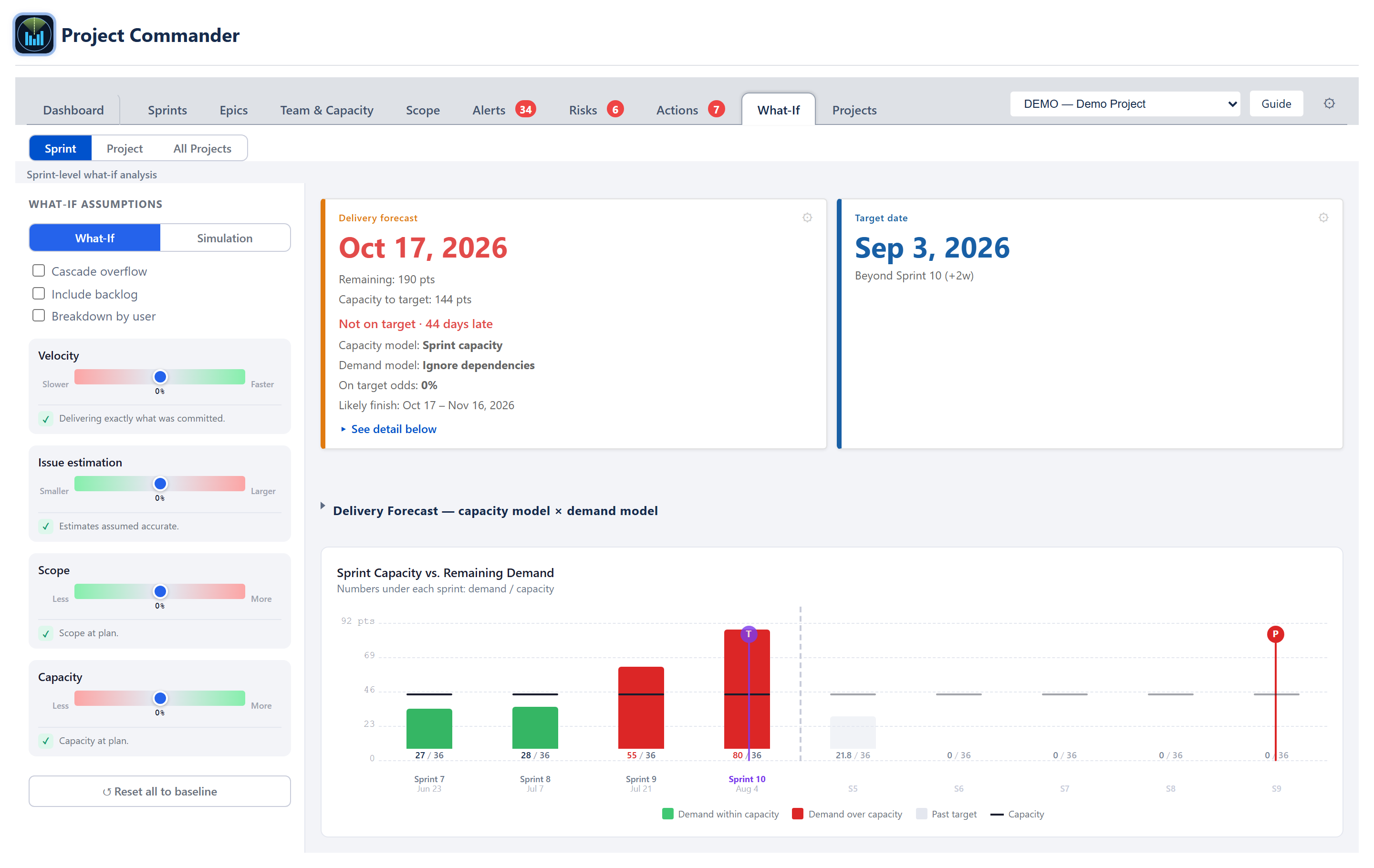
Four horizontal sliders, range −50% to +50%:
- Velocity — scales sprint capacity. Negative = team running slower than recent history; positive = faster.
- Estimation — scales sprint demand. Negative = work smaller than estimated; positive = larger.
- Scope — scales sprint demand. Negative = backlog tightening; positive = scope growth.
- Capacity — scales sprint capacity directly. Negative = absences / context-switching; positive = headcount or efficiency.
Velocity and Capacity multiply together when both are non-zero (capacity *= (1 + velocity/100) × (1 + capacity/100)). Estimation and Scope multiply together on the demand side identically.
Dragging any slider re-runs the cascade simulation in real time. Releasing the slider commits the value to local component state — there is no save button.
Breakdown by user
A Breakdown by user checkbox (off by default) splits each cascade bar into per-assignee demand segments instead of one aggregate bar, so you can see whose work sits in each sprint. It is a display option only — the four sliders still apply globally; there is no per-member slider override. A Reset all to baseline button returns every slider to zero.
Cascade chart
The right-hand panel is a stacked cascade bar chart. One bar per sprint along the X-axis; demand on the Y-axis in points or hours.
- Bars — by default each sprint is one aggregate demand bar; ticking Breakdown by user stacks it by assignee in deterministic name-hash colours with an Unassigned segment in grey.
- Capacity line — a thin horizontal mark inside each bar at the sprint's capacity. For the ACTIVE sprint this is its remaining capacity — the sprint's figure scaled to the days still ahead (ruling 2026-07-10) — so a half-finished sprint shows a half-height line and its over/under read matches the Sprints tab header.
- Cross-hatched overflow — a Cascade overflow checkbox (off by default) renders demand above capacity as a 45° red cross-hatch carrying spillover into the next sprint; with it off, overflow is not cascaded.
- Virtual sprints — when overflow extends past the last planned sprint, the chart appends faded virtual columns (labelled S7, S8, …) sized at the team's average sprint capacity.
- Markers — a vertical purple line marks the Target sprint; a vertical line marks the Projected completion sprint, green when P ≤ T and red otherwise.
(Ghost "baseline" bars behind the active bars are a feature of the Project view's chart, not this Sprint-view cascade.)
A legend below the chart explains the assignee colours, the unassigned grey, the overload cross-hatch, and the capacity line.
Forecast cards + comparison grid
Above the cascade chart, What-If mode shows the same Delivery forecast card and Target date card as the Dashboard (the On-plan and Progress cards are hidden, and the two are widened to fill the row). The Delivery forecast card carries the projected finish date, work remaining, capacity to target (clipped at the target date — when the plan holds capacity beyond the target, an extra line states N pts capacity available after target date), the on-time verdict, the chosen capacity model and demand model, the on-target probability and likely-finish range — and the "Complete" / "Never" terminal labels. The same amber notices as the Dashboard card apply here: Efficiency assumed when the Effective model has no measured history, and Team capacity reads 0… when the Team or Effective model resolves to zero capacity while work remains. Its gear opens the capacity-model, demand-model and scope-growth controls. Beneath the cards, the collapsible capacity model × demand model grid shows every pairing at once. The sliders move all of these live with each drag, exactly as they move the cascade chart.
Per-slider risk statement
Each slider has a one-line plain-English statement that updates as the user drags. The statement names the affected sprint (e.g., Overflow begins in Sprint 6, completion pushed to Sprint 9) so the consequence of the slider change is always one glance away.
Simulation (Monte Carlo) mode
Switching to Simulation mode replaces single-point sliders with low/high range pickers and replaces the cascade chart with an S-curve.
Uncertainty ranges
In Simulation mode each variable is a low–high range rather than a single value. The ranges start from a realistic default spread (velocity −15 to +10, estimation −10 to +15, scope −5 to +15, capacity −15 to +10) and can be adjusted. There are no Conservative / Realistic / Optimistic preset buttons — the defaults are simply applied.
S-curve chart
X-axis is sprint index (fractional 0.5 steps allowed). Y-axis is cumulative probability of completing by that sprint.
- The chart is built by running the cascade simulation many times — 2,000 runs in the Sprint sub-view and 5,000 in the Project sub-view — with each run drawing values randomly inside the ranges.
- Each run applies a 50/50 split between a single global trend factor (everyone has a similar good or bad sprint) and per-user noise (individuals still vary independently).
- The chart fits a Catmull-Rom spline through the cumulative-probability histogram so the curve reads smoothly.
- A green dot marks the P85 crossing (planning-safe sprint); a purple dot marks the target sprint with its on-time probability label.
- Optional ghost curve in faded grey shows a baseline scenario for before/after comparisons.
Simulation KPI row
Above the S-curve:
- Target Sprint — dropdown to override the goal; shows a
*badge when manually set. Defaults to the last sprint with demand or the project's target date sprint. - On-target probability — % of runs that finished on or before the target. Green ≥ 70, amber 50–69, red < 50.
- Finish on Time? — verdict pulled from the probability: Yes / Maybe / No.
- Expected slip — average sprints late among runs that missed; green when 0, amber ≤ 1, red > 1.
- Feasibility — a 0–100 plan-feasibility score banded High / Medium / At Risk / Critical (ALGORITHMS section 8); reacts to the sliders like the other cards.
The weekly chart and the Delivery forecast card above it share one weekly capacity rate: every chart week's capacity bar equals that rate, and the card's Capacity to target equals the same rate over the weeks between today and the target (clipped at the target; the current week — and, with sprints on, the active sprint — contributes only its remaining day-fraction, ruling 2026-07-10). When the plan's due dates cover every week up to the target, the chart's bars up to the target sum exactly to the card's figure; weeks with no due work draw no bar, so on sparse plans the bar sum can be less than the card.
AI Chat (Sprint view)
A chat card sits below the cascade chart with placeholder text Ask a question about the project… and an Analyse button.
The user's free-form question is sent along with a structured payload: per-sprint capacity / demand / overflow, per-issue details, team context, per-assignee workload, time off, holidays, velocity history, backlog summary, and a one-line current-status string (On track, 2 sprints late at baseline, etc.).
The model returns a structured answer with these parts:
- Summary — a 2–4 sentence narrative answer.
- Impact assessment — four cards (capacity, schedule, risk, and team impact), each with a severity (positive / negative / neutral), a short label, and a one-sentence detail.
- Recommendations — 2–4 suggested actions with priority high / medium / low.
- Suggested slider values — proposed changes to the four sliders, in percentage points.
- Per-sprint adjustments — for each named sprint, an absolute change to its capacity and demand, with a short reason.
The four sliders are written back from the suggested values, clamped to ±50. Per-sprint deltas are validated against the actual sprint name list and applied as absolute values to the sprint's capacity and demand. The cascade chart re-runs immediately with the new inputs; the user sees the slider positions move and the bars shift.
The AI never computes the forecast itself — it only proposes adjustments, and the deterministic engine applies them.
No-key state
When no AI API key is configured in Settings → AI Features, the chat box reads Add your Anthropic API key in Settings → AI Features to enable AI analysis and the textarea / button are hidden.
Loading / error
While the AI call is in flight the Analyse button reads ⏳ Analysing… and is disabled. Auth errors are caught and shown as Invalid API key. Check your key in Settings → AI Features. Other errors render the model's error text.
Project view
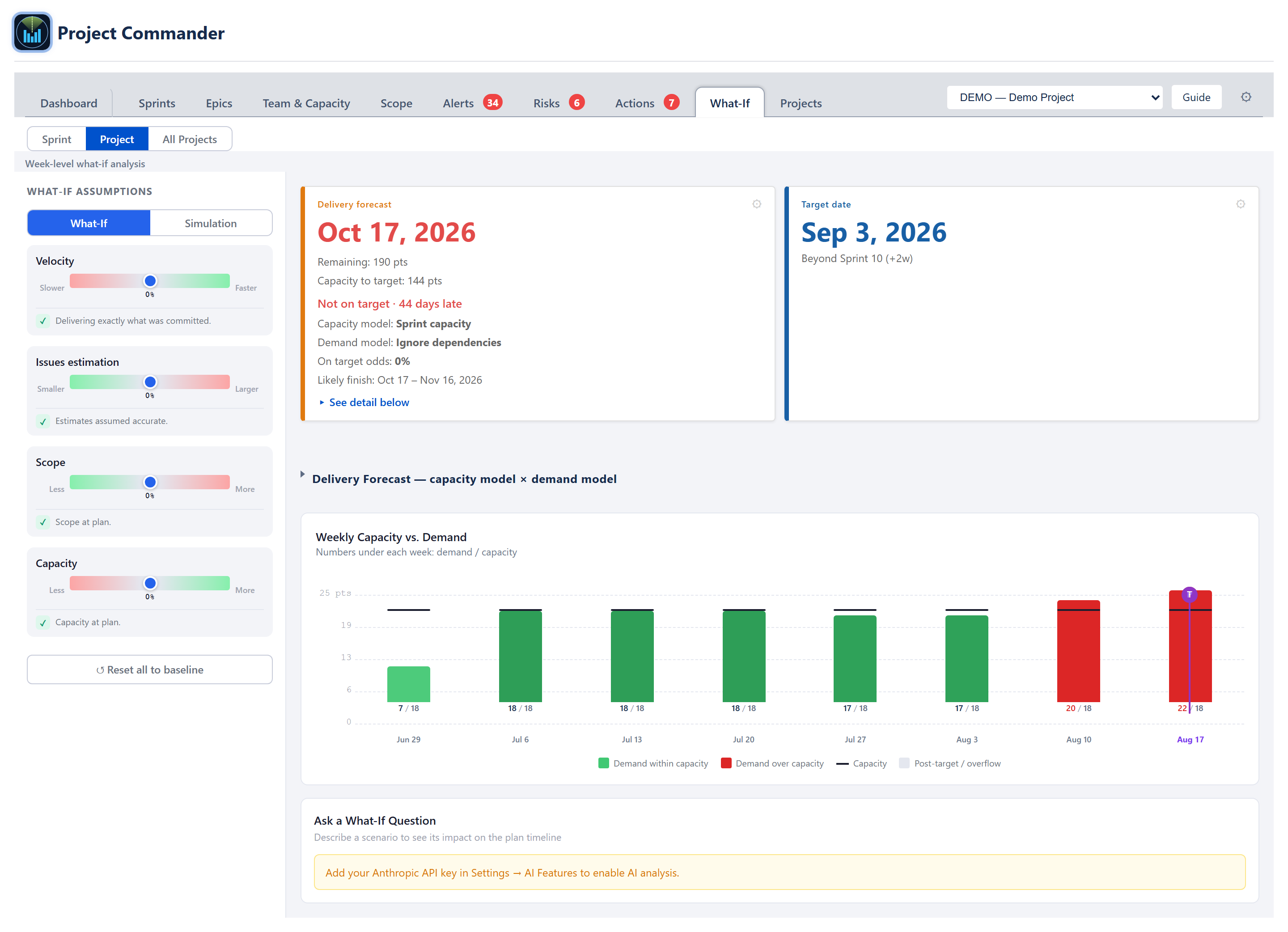
Same chart and chat shape as Sprint view, but the X-axis is ISO calendar weeks (Mon–Sun) and the demand is bucketed by the issue's due date. When an issue has both start and due dates the demand is spread evenly over the spanned weeks, prorated by the weekday-overlap fraction (a week the range only touches Mon–Wed counts as 3/5 of the issue's weekly share).
Undated issues alert
Issues without a due date can't be placed on the weekly timeline, so they are called out in a small ⚠ alert beneath the chart — "N issues without dates — not shown in the chart" — listing the issue keys when there are ten or fewer, rather than dropping them silently.
Simulation result cards
Switching the Project view to Simulation mode runs a Monte Carlo forecast and shows five cards above the probability-distribution chart: Target Week (a dropdown that sets the week the simulation is measured against — auto by default, with a * and a Reset to auto link once you override it), On-target probability (the share of simulation runs that finish by the target week), Finish on Time? (Yes / Maybe / No read from that same run probability at the shared 70%/50% bands — the identical rule the Sprint sub-view uses, so it reacts to the sliders), Expected slip (the average delay past the target across the runs that missed it, shown as None or +X weeks, with the percentage of runs that missed), and Feasibility (a 0–100 plan-feasibility score banded High / Medium / At Risk / Critical — capacity vs demand, delivery timing, over-capacity periods, and overflow; the rule is ALGORITHMS section 8).
AI Chat (Project view)
Same structured answer and rules as the Sprint view, and the payload is week-bucketed. The one difference: the Project view applies only the chat's suggested slider values — it does not apply the per-sprint adjustments the way the Sprint view does.
All Projects view
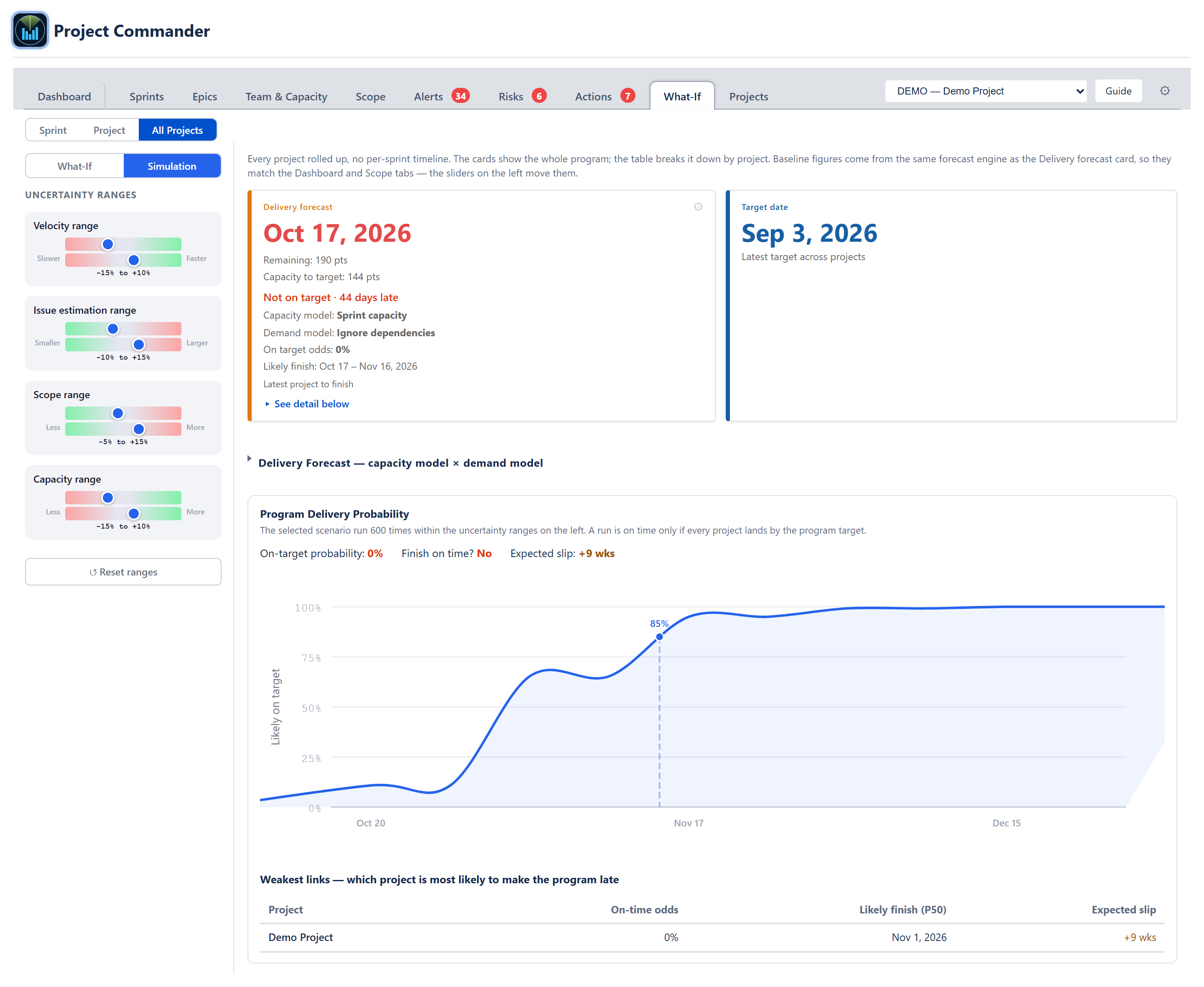
The third sub-view has no timeline — it rolls every project up into one program forecast, the same rollup the Dashboard's Program View and the Scope program view use. It follows the project picker at the top of the tab: with Program view selected it covers every registered project; pick a single project and it shows just that one.
A What-If / Simulation switch sits at the top of the left sidebar, the same as the Sprint and Project sub-views.
What-If mode
- The left sidebar has the four sliders (Velocity, Issue estimation, Scope, Capacity) and a Reset all to baseline button.
- The header shows the rolled-up Delivery forecast card and Target date card. The Delivery forecast card reads the program finish (the latest project to finish), the work remaining and capacity to target (per unit, so points and hours never mix), the on-target odds and likely-finish range, and the two models — its capacity model reads "Per project" for a multi-project rollup. The Target date is the latest target across the projects.
- The collapsible capacity model × demand model grid rolls every pairing up across the projects.
- A per-project table lists each project's Demand (work remaining), Capacity (to the target), and Forecast (projected finish), with a Program total row per unit. A project that cannot finish reads "Never"; when all work is done the program reads "Complete."
- The four sliders run through the same forecast engine the single-project views use, so a project's numbers match its own Sprint / Project / Dashboard views at every slider position.
Simulation mode
Flipping to Simulation swaps the sliders for uncertainty ranges (a low–high band per variable) and replaces the per-project table with the Program Delivery Probability panel:
- On-target probability — the share of runs in which the whole program finishes by the program target. A run counts as on time only if every project lands by the target.
- Finish on time? — a plain Yes / Maybe / No read from that probability.
- Expected slip — how far past the target the late runs land on average, in weeks.
- Probability-over-time curve — the chance of being finished by each date, with the target marked.
- Weakest links — a table of each project's own probability of landing by the program target, worst first, so the project dragging the program down is at the top; a project that can never finish sits at the very top, marked Never.
The program odds work by forecasting each project on its own, running the sprint-based ones many times, and combining them so that in each run the program finishes with its latest project. If no project in the program runs on sprints with a team, no probability is shown (the same way a single sprintless project shows none). Each project is forecast on its own team's capacity, with that project's allocation from the Team Allocation Matrix (Projects tab) applied — so a person split across projects is counted at their allocated share, not at full capacity on each.
Cross-cutting modes and empty states
- No data — Sprint view — No Sprint Data — Configure sprints or enable Test Mode.
- No data — Project view — No Plan Data — Configure JQL or enable Test Mode.
- No due dates — Project view — Issues Need Due Dates — Plan Risk uses due dates to build a weekly timeline.
- Estimation mode — bar labels switch between pts, hrs, days depending on the project's mode and time unit.
- Program view — the All Projects sub-view rolls up every registered project; use it for program-level what-if and simulation. The Sprint and Project sub-views remain single-project in nature.
How the numbers are computed
- Cascade simulation — see ALGORITHMS section 1 (Delivery Forecast) and the slider semantics in the Appendix.
- Monte Carlo — section 2 (Monte Carlo Delivery Confidence). Run counts: 2,000 in the Sprint S-curve, 5,000 in the Project S-curve; the card/grid on-target odds use a 250-run pass and the All Projects program Simulation 600.
- Weekly bucketing — section 5 plus the Plan-Risk weekly bucketing variant; the weekday-overlap proration uses the ISO-week utilities documented in the Foundation Utilities section.
- Feasibility score — section 8.
- AI prompt + response schema — sections 18 (What-If Sprint AI) and 19 (What-If Project AI).
Effects on other parts of the app
- Slider state is ephemeral — closing the tab, reloading the page, or switching sub-views resets every slider to baseline. Nothing writes back to the project config or to Jira.
- Dashboard AI Insights link — when the Dashboard's AI suggests slider values, the Open the What-If tab to explore this scenario interactively link opens this tab with those values pre-applied.
- No effect on the deterministic forecast outside this tab — the Sprints, Scope, and Dashboard forecasts all read the project config (not the What-If sliders), so they stay on baseline until the user changes the underlying configuration explicitly.
- AI fallback alignment — Auto-Level AI Review and Risks Accept dialog use the same provider/key configured in Settings; if the key works in this tab it works everywhere.