 Project Commander Docs
← Back to site
Project Commander Docs
← Back to site
Scope Tab — Feature Guide
What it's for
The Scope tab tells the user how scope has changed over the life of the project, what's left, and whether the team is keeping up with — or falling behind — its own moving target. It exists because scope is rarely a constant: stories get added, estimates get revised, work gets pulled, and the deadline does not always move with them. The tab makes that movement visible.
It answers four questions: how much scope is in the project right now; how much of that has been done; how much it has grown or shrunk since a baseline date; and at the current pace, when will all the work finish.
The audience is delivery managers, programme leads, and engineering managers who own the deadline. The tab is a single project view; in Program All mode the scope numbers aggregate across projects but sprint-marker overlays are suppressed because cadences differ.
Header / stat cards
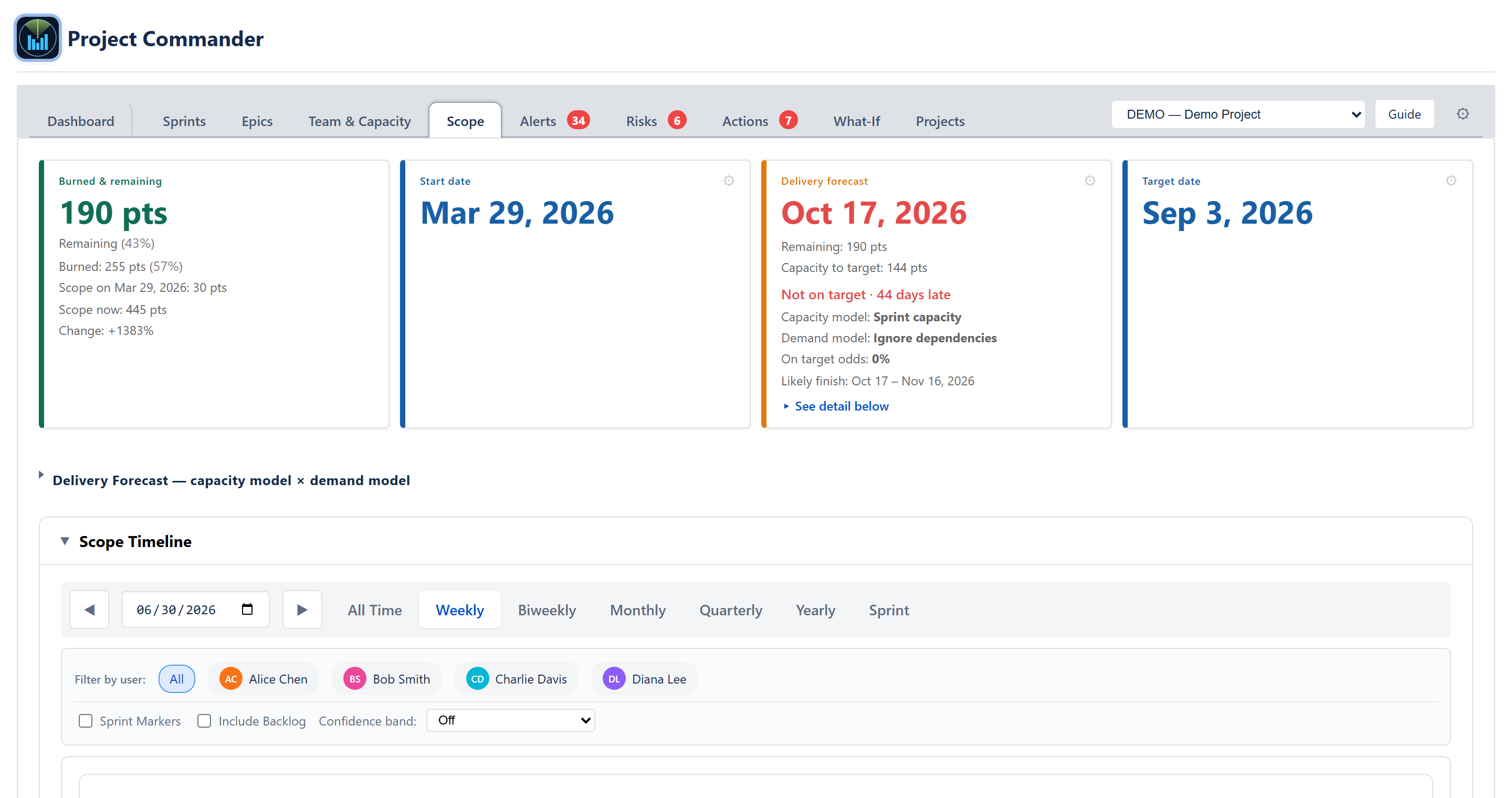
Four stat cards across the top.
Burned & Remaining card
Shows the breakdown of the current scope.
- Burned — sum of estimates on done issues, plus the percentage of total scope they represent.
- Remaining — sum of estimates on non-done issues, plus the percentage they represent.
- When a Start Date is set, the card adds a third line: Scope at start vs current scope, with a signed percentage change. (The percentage is shown in a single style — there is no amber/red threshold colouring on this figure.)
Start Date card
Anchors the timeline. Choose how the start is defined:
- Fixed — explicit calendar date entered by the user.
- Earliest start — the oldest issue's created date; the default.
- Earliest due — the issue with the earliest due date.
- Earliest sprint start — the start of the first sprint, when sprint mode is on.
The card shows the resolved date underneath the chosen method. Switching method re-anchors the chart and the burndown immediately.
Target Date card
Anchors the deadline. Three methods:
- Fixed — explicit date.
- Latest due — the latest due date across the issue set.
- Latest sprint end — the last planned sprint's end date.
The resolved date shows beneath the method label. The chart draws a red dashed reference line at the target. The ideal-burndown line runs from the starting scope at Start Date down to zero at Target Date.
Delivery Forecast card
The same Delivery forecast card the Dashboard and What-If tabs use, so the projected completion date for all remaining work reads identically across tabs.
- Primary value: a single date, or Complete when no work remains, or Never when the plan can't deliver the remaining work (no capacity, or scope growing at least as fast as the team burns it down).
- Lines: Remaining (work left) and Capacity to target (capacity between today and the target date, clipped at the target — a straddling sprint counts only its days on or before it). When the plan holds capacity beyond the target, an extra line states it: N pts capacity available after target date.
- Amber notices under the caption when supply-side data is missing: Efficiency assumed — no completed-sprint history yet (Effective model with no measured efficiency), and Team capacity reads 0 — no per-sprint capacity is calculated yet. Check sprint dates and the Team & Capacity tab. (Team or Effective model resolving to zero capacity while work remains — the explanation for a "Never" date with capacity 0).
- Status: On target / At risk / Not on target · N days late.
- Capacity model and Demand model caption, plus On target odds and a Likely finish range (from a Monte-Carlo run of the plan).
- Settings (the gear): a Capacity model dropdown (Sprint capacity / Effective capacity / Team capacity / Velocity with sprints on; Team and Effective only with sprint mode off — choosing Velocity reveals a use last N sprints input), a Demand model dropdown (Ignore dependencies / Respect dependencies / Critical Chain only / Resequence work), and a Scope growth method control (off by default; or Average = the project's own historical rate, or Manual = a rate you type). When growth ≥ the team's rate the card reads Never.
Capacity model × demand model grid
Below the cards, the same collapsible capacity model × demand model grid the Dashboard shows is available here: every pairing's finish date, gap to target, and on-target odds in one grid, with the Critical Chain floor as a merged column and the soonest/latest finishes flagged. Clicking a square drives the Delivery forecast card, and the demand model is a shared choice with the Dashboard and What-If tabs.
Scope timeline chart
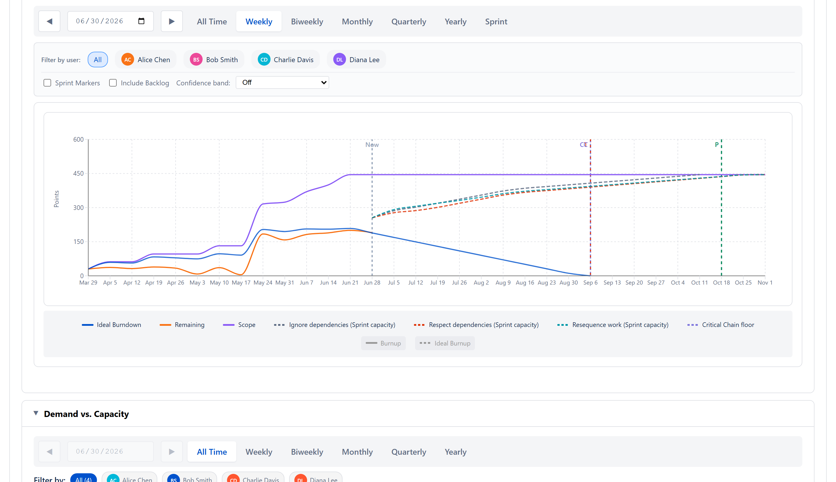
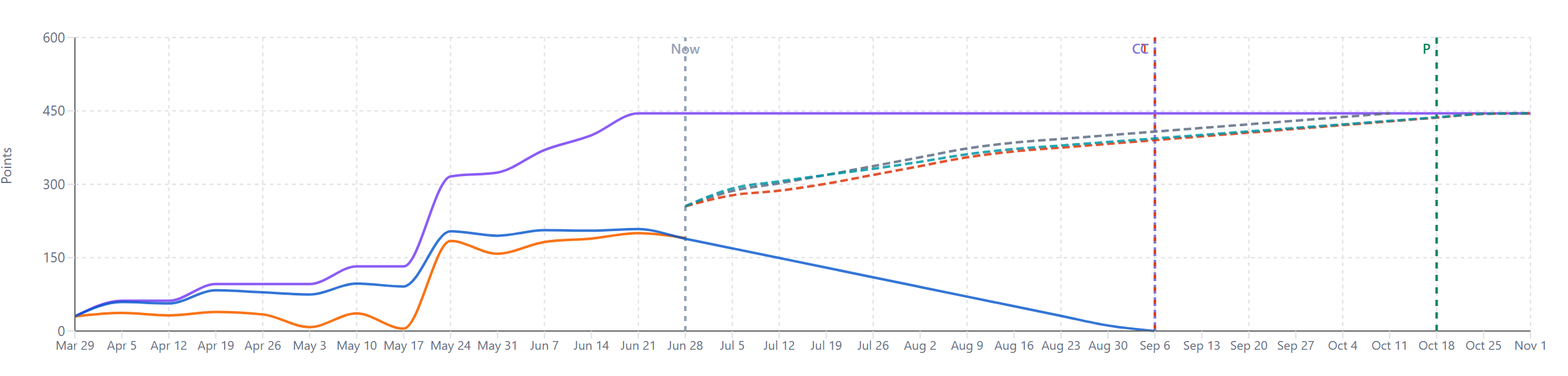
The primary chart. Collapsible Scope Timeline section. X-axis = time bucketed by the period selector; Y-axis = points (or hours / days under time mode).
Period selector and navigation
Buttons across the top of the chart: All Time, Weekly, Biweekly, Monthly, Quarterly, Yearly, Sprint. Plus left/right arrow navigation, a date picker for jumping to a specific period, and a Reset button that re-centres on today.
Sprint mode buckets by the project's actual sprint windows so each x-axis tick corresponds to one sprint. It is hidden when sprint mode is off and when the project has no sprints yet.
In All Time mode, the X-axis spans from the resolved Start Date through today (or through the projected end when forecast is enabled). Period navigation is disabled in this mode — there is no period to step.
Core series
The chart renders a burndown view and a burnup view of the same scope data — together they tell the same story from two angles.
Burndown view (start-high, end-low):
- Scope (purple, solid) — total estimate of all currently active issues, replayed back through the changelog so the chart shows the historical scope at each bucket.
- Remaining (orange, solid) — Scope minus cumulative completed work. Falls only when work is done; rises when scope is added faster than it is completed.
- Ideal Burndown (blue, solid) — straight line from starting scope at Start Date to zero at Target Date. Position above the line = ahead of pace; below = behind.
Burnup view (start-low, end-high):
- Burnup (green, solid) — cumulative completed work over time. Mirrors the Remaining line: every point burned down lifts the Burnup line by the same amount. Stays flat across periods where nothing closed.
- Ideal Burnup (light green, dashed) — straight line from zero at Start Date up to the current Scope total at Target Date. Position above the line = ahead of pace; below = behind. Re-anchors when Scope grows so the target keeps tracking the moving goal.
- Burnup Forecast (green, dashed extension) — projected continuation of the Burnup line from today through the resolved end date, using the same throughput and growth assumptions as the burndown Forecast. Ends at the resolved Scope at the projected completion point.
The two views are stacked on the same axis so a planner can read whichever framing they prefer; teams that report progress as "completed" read the burnup, teams that report it as "remaining" read the burndown. The three Burnup series are hidden by default — turn them on from the chart legend.
Optional series
- Scope Growth (purple, dashed; labelled Scope Growth in the chart legend) — extrapolation of the historical add-rate forward in time. Shown when growth detection is enabled.
- Forecast — a projected line for each demand model, drawn from today and climbing to meet the Scope line on its own finish date: Ignore dependencies, Respect dependencies, and Resequence work (each labelled with the chosen capacity model), plus the Critical Chain floor. The chart marks the target date with a T, the Critical Chain date with CC, and the projected completion with a P.
- Confidence band — shaded area around the forecast line, optional. Two modes: Historical variability (width derives from the team's own velocity, scope-change, and estimate-vs-actual stddevs combined via root-sum-of-squares) and Monte Carlo (sampled from ~600 randomised runs, P10–P85 envelope). Both fan out on the time axis — left edge finishes earlier, right edge finishes later.
Sprint markers
A Sprint Markers checkbox. When on, vertical lines mark sprint starts (solid) and ends (dashed). A second checkbox Include Completed Sprints toggles whether closed sprints are also marked. In Program All mode the whole sprint-marker control is hidden because cadences differ across projects.
Per-user filter
When the team has multiple assignees a filter row appears with chips: All + one chip per assignee. The filter is multi-select — clicking chips adds and removes individual people; All is restored once no chip is selected. (The per-user scope/remaining/ideal lines on the chart render only when exactly one user is selected.)
Demand vs. Capacity section
A collapsible Demand vs. Capacity section between the Scope Timeline and the Period Breakdown table (collapsed by default). It plots the team's workload against its capacity day by day and flags the stretches where the plan asks for more than the team has.
Chart and controls
- Period bar — All Time (default), Weekly, Biweekly, Monthly, Quarterly, Yearly, with arrow navigation and a date picker (disabled in All Time).
- Per-assignee filter — single-select chips; picking one person re-runs the analysis with only their work and their capacity, so an individual's overload is visible even when the team as a whole has room.
- Demand placement buttons — Sprint Dates (spread each issue's remaining work across its sprint's window; shown only in sprint mode with sprints), Spread (spread from the issue's start date to its due date), Due Date (place all of it on the due date). An Include Backlog checkbox controls whether issues outside any sprint participate.
- Capacity source buttons — Project default (the per-project Sprint Capacity / Capacity limit from Projects → Edit, split evenly across the team), Team capacity (weekly values from the Team & Capacity tab, minus PTO and holidays, times utilization), Effective capacity (N%) (Team capacity × the measured delivery efficiency; the option appears once history exists).
- Sprint Markers checkbox (+ Include Completed), and a warning banner counting issues without dates that can't be plotted.
- The chart shows daily capacity and demand bars plus cumulative lines, time-spent and scope overlays (togglable from the legend), a summary strip with cumulative capacity, cumulative demand and the Over by amount, and red overload flags on days where cumulative demand exceeds the capacity that can still absorb it.
How overload is counted (remaining-capacity rule)
In Spread and Due Date modes, open work is scheduled no earlier than today — so the capacity that the overload flags, the overloaded-periods list and the section's feasibility score count is also only the capacity from today forward. Capacity on days that have already passed was spent on the work that is now done; letting it offset future demand hid real overloads. The per-day bars still show each past day's historical capacity — only the overload/score arithmetic ignores it. In Sprint Dates mode both demand and capacity spread across the full sprint windows, so nothing is clipped there.
Resource Breakdown table
Below the chart (always visible, independent of the chart's collapse state): one row per team member.
- Issues — count of issues assigned to the person.
- Demand — the remaining estimates of their open issues.
- Full Capacity — their share of the whole analysis windows, elapsed days included. This is context for time already spent.
- Remaining Capacity — Full Capacity scaled to the part of the window still ahead of today, using the same linear day-fraction rule as the sprint cards: a window wholly in the past contributes 0, a wholly future window contributes everything, a half-elapsed window contributes half.
- Load — Demand ÷ Remaining Capacity. Shows — when no capacity remains.
- Status — pill from the shared load bands: below 60% Underloaded, 60–90% Available, 90–115% Optimal, above 115% Overloaded.
Period Breakdown table
Below the chart, a collapsible table titled [Period] Breakdown (Weekly Breakdown, Monthly Breakdown, etc.). One row per period.
Columns
- Period — the bucket label (e.g., May 10).
- Issues — count of issues with scope events in the bucket; click to expand.
- Added — story points added in the bucket through new issue creation or estimate increase. Blue when non-zero.
- Burned — work completed (resolved) during the period. Green when non-zero (grey when zero).
- Completed — cumulative points completed by end of bucket; monotonically increasing unless retroactive scope changes.
Expansion
Clicking a period expands it to list every issue that contributed to that period. Each row shows the issue's key (linked), summary, current assignee with avatar, status pill, and which event-type categories it appears under. An issue can show in Added and Completed in the same period if it was created and finished in the same bucket.
Scope events
Three kinds of event drive the timeline:
- Creation — issue is created with a non-zero estimate; that estimate joins scope on the create date.
- Estimate change — an issue's story points (or original time estimate in time mode) is edited; the delta is added to scope on the change date.
- Status to "removed" — issue transitions to a removed-set status (Cancelled, Won't Do, Won't Fix, Rejected, Duplicate, Invalid). Its current estimate is subtracted on the transition date.
The Scope line is the cumulative running sum of these signed deltas. The events come from Jira's changelog so they are tied to wall-clock time, not sprint boundaries.
Scope growth detection and "never finishes"
The forecast card's Scope Growth Rate readout is computed by:
- Bucketing all creation and removal events by ISO week.
- Computing the net points added per week (issues created minus issues removed, by points).
- Converting to points per sprint using the project's sprint length in weeks.
Two failure-mode signals fall out of this:
- When scope growth ≥ velocity and the simulation never empties the queue, the forecast returns the explicit never finishes state. This is preferred over an infinite date so the user gets an actionable signal.
- When the growth rate is high but velocity is higher, the forecast still completes but the projected end may sit further out than the no growth projection.
Cross-cutting modes and settings
- Estimation mode — points mode reads story points; time mode reads the original time estimate converted to hours (or to 8-hour days). The chart's Y-axis label and table units adapt.
- Sprint mode on/off — when off, sprint markers are hidden. (The date-card radio options, including Earliest sprint start and Latest sprint end, are still listed regardless of sprint mode.) The forecast still works using configured throughput.
- Include backlog — controls whether unscheduled backlog issues participate in scope. Backlog inclusion can change scope growth rates noticeably if the backlog was populated upfront rather than over time.
- Program View — sprint markers are forced off; the forecast rolls each project up on its own team's capacity (with that project's allocation from the Team Allocation Matrix applied) and the program finishes with its slowest project, so the capacity model reads Per project.
Empty / error states
- Loading — while issues are still streaming in.
- Configure a JQL filter in the Projects tab — when the project has no JQL configured.
- No issues found for JQL filter — when the JQL returns zero rows.
- No timeline data available — when issues exist but no scope events fall inside the visible window.
How the numbers are computed
- Burndown / Remaining / Scope lines — see ALGORITHMS section 1 (Delivery Forecast) and the Burndown Chart Data subsection of the Appendix.
- Scope Growth Rate — section 3 (Scope Growth Detection).
- Forecast curve / P50 / P85 — section 1 plus section 2 (Monte Carlo Delivery Confidence) for the band shading.
- Scope event reconstruction — Appendix → Scope Trajectory subsection.
- Period bucketing / partial-week proration — Appendix → Date and Timeline Math and ISO Week Conversion.
Effects on other parts of the app
- The Scope row in the Dashboard's Project Statistics table reads the same growth rate and change % shown on the stat card.
- The Dashboard's Team Balance row and the Can We Deliver? per-member detail are computed by the same demand-vs-capacity engine as the Resource Breakdown table here, so each member's load % (remaining work ÷ remaining capacity, full capacity listed alongside) reads the same in both places.
- The Delivery Forecast card on the Dashboard uses the same forecast utility and respects the Scope growth selector value chosen here. Toggling growth on the Scope tab changes the Dashboard's projected end immediately.
- The Sprint Risks engine's Mid-sprint scope creep detector uses the same scope event timeline and the same scope-creep warning threshold.
- Changes to Velocity sprint count persist into project config and propagate to every other forecast view.